Hranipex
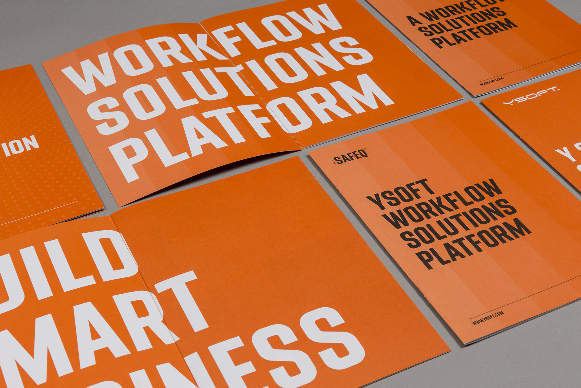
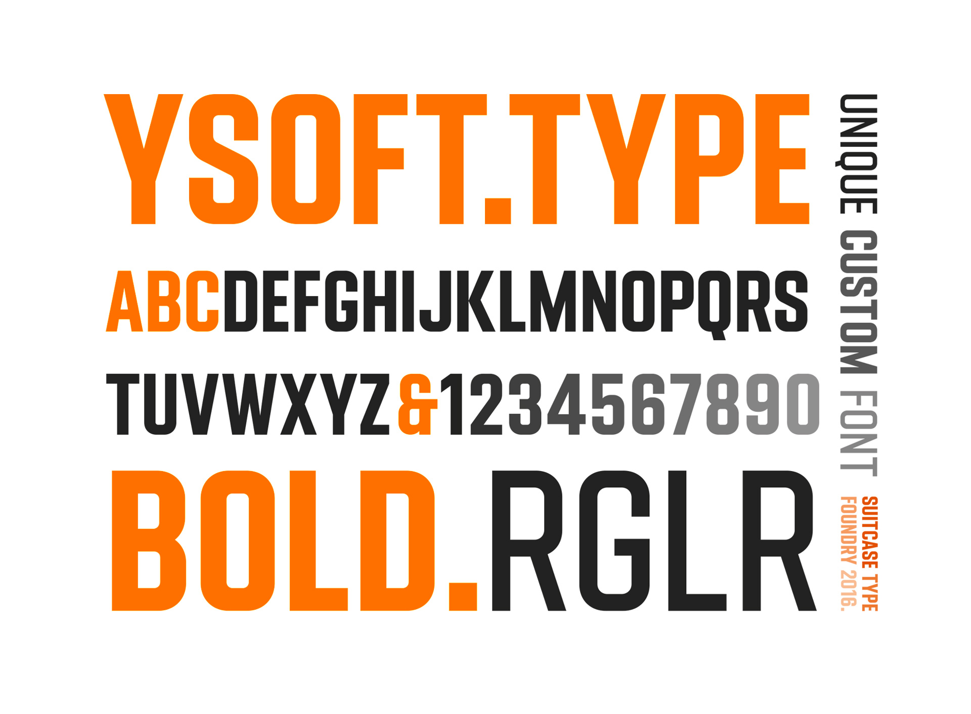
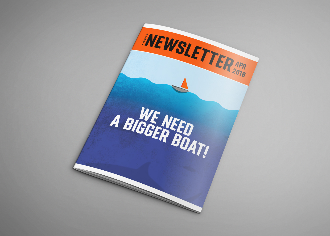
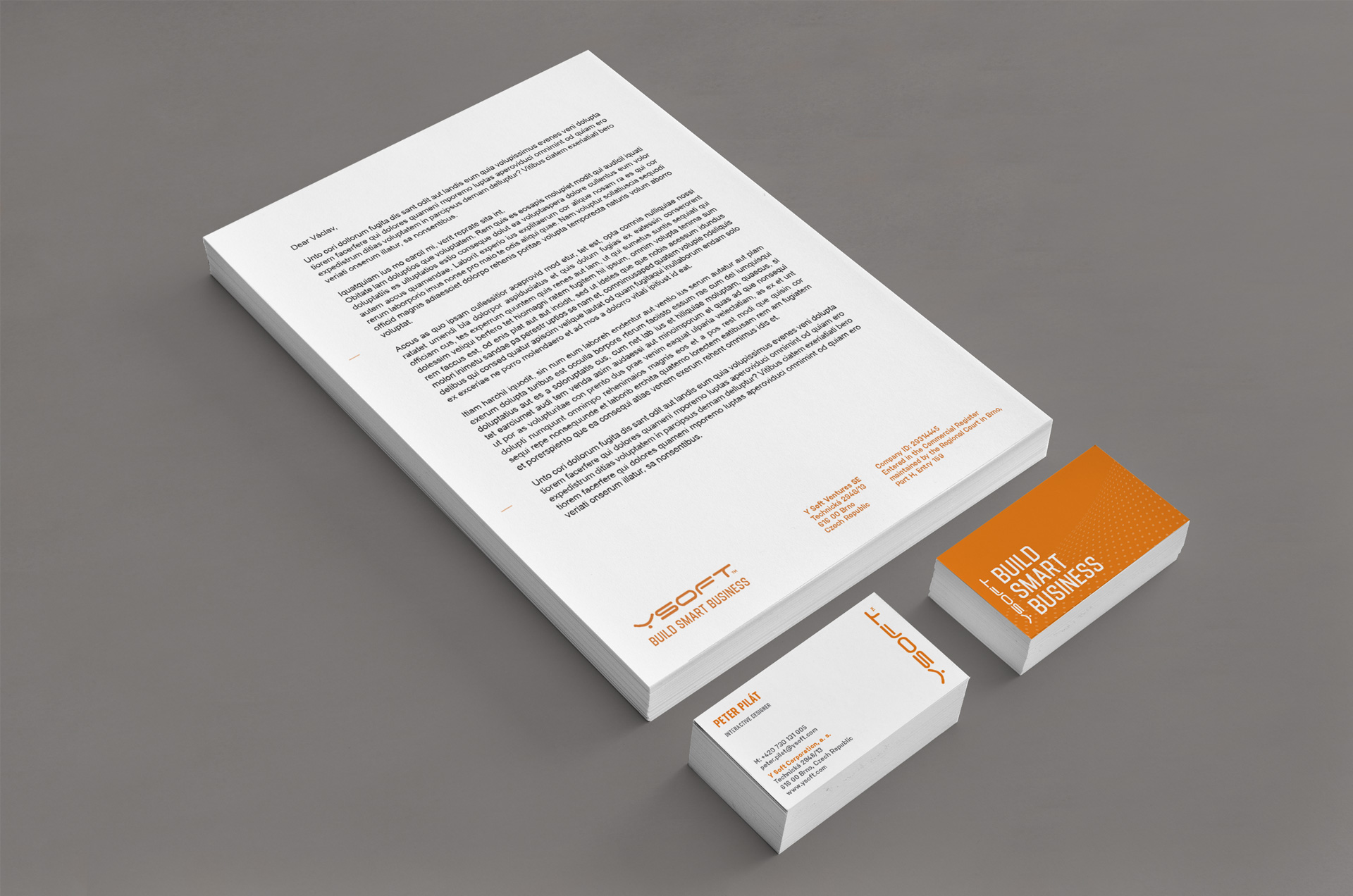
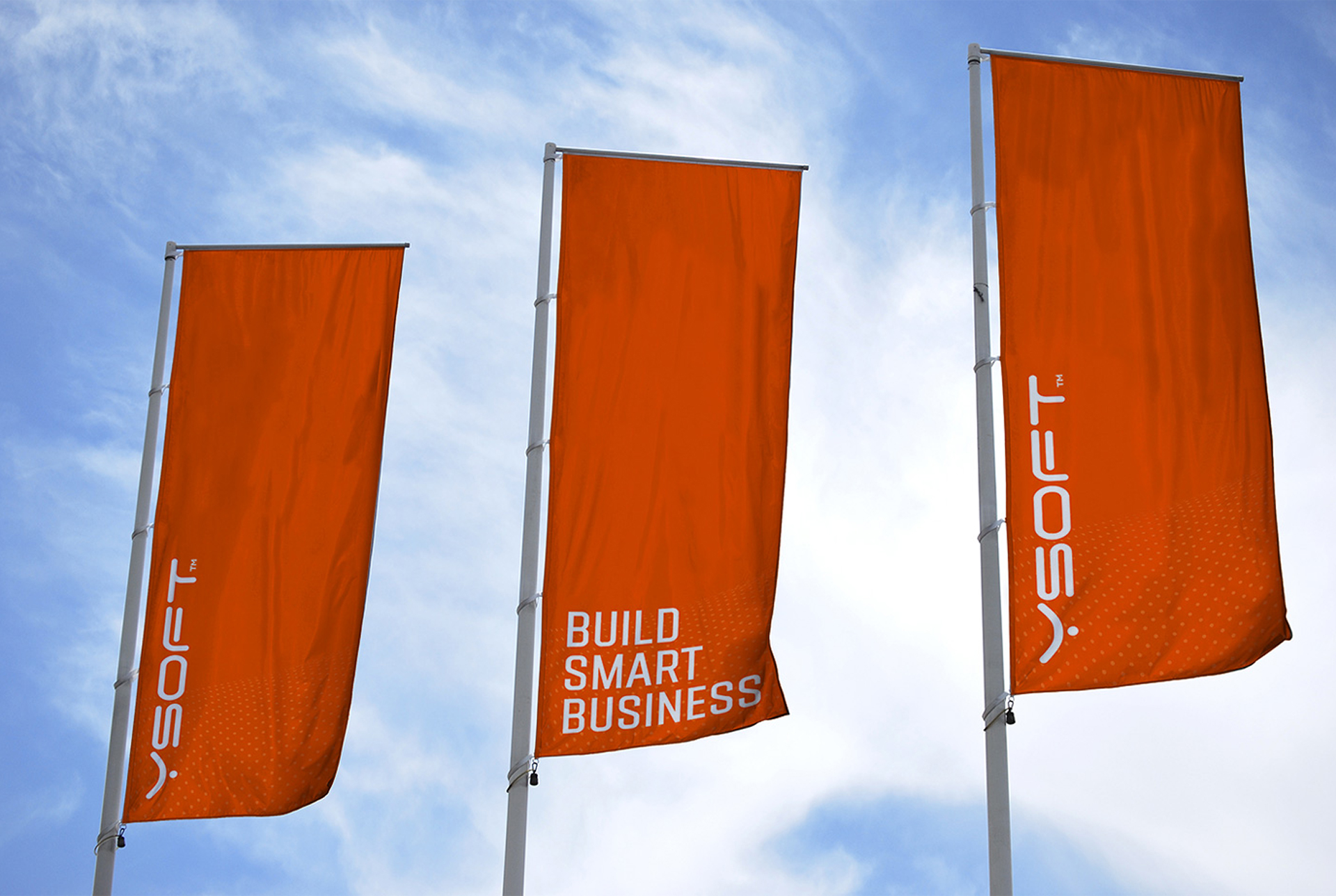
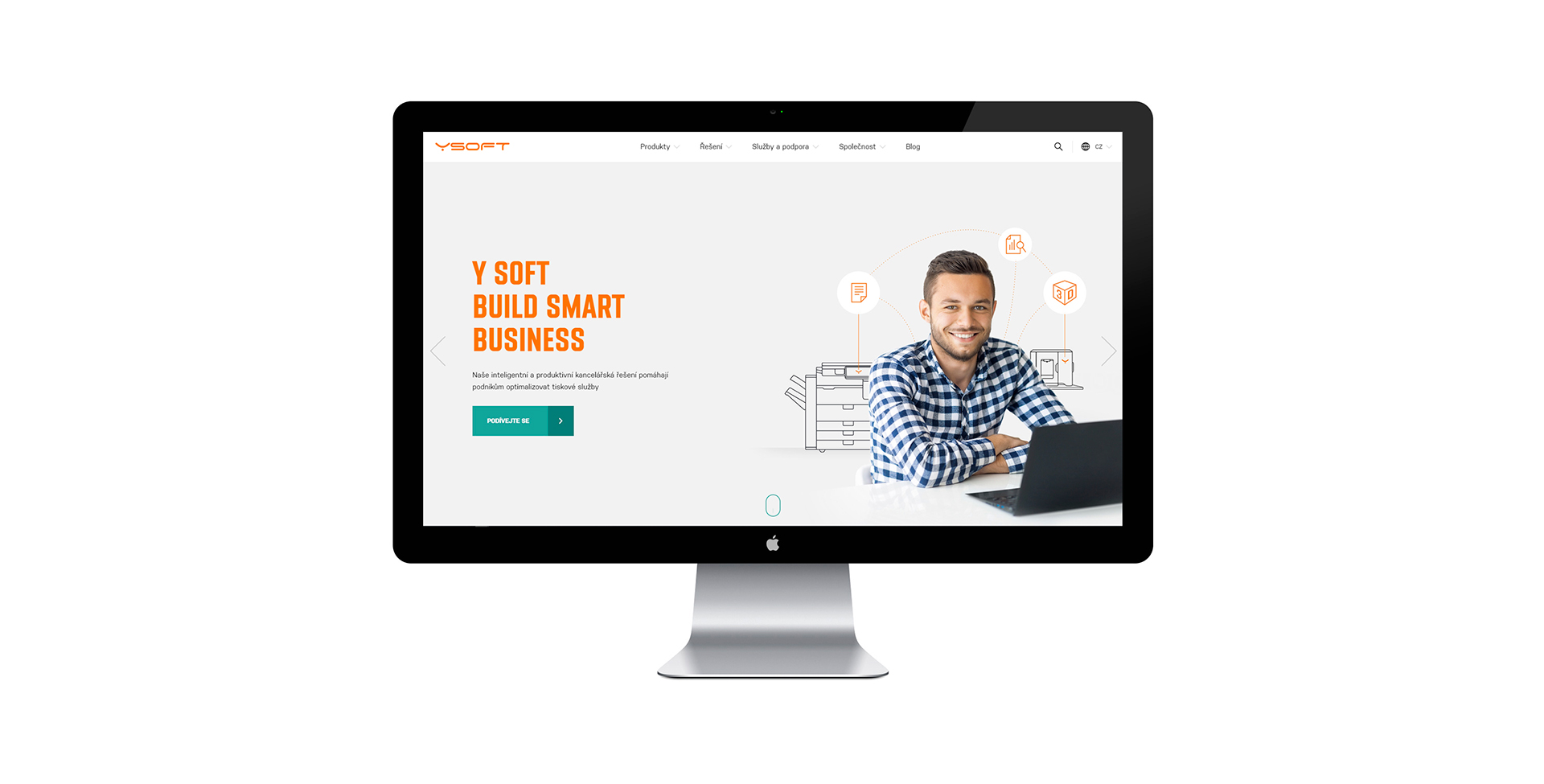
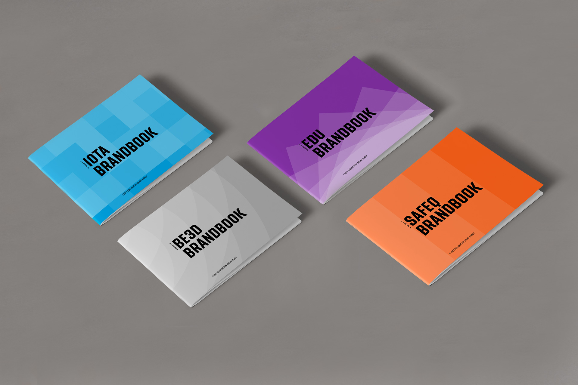
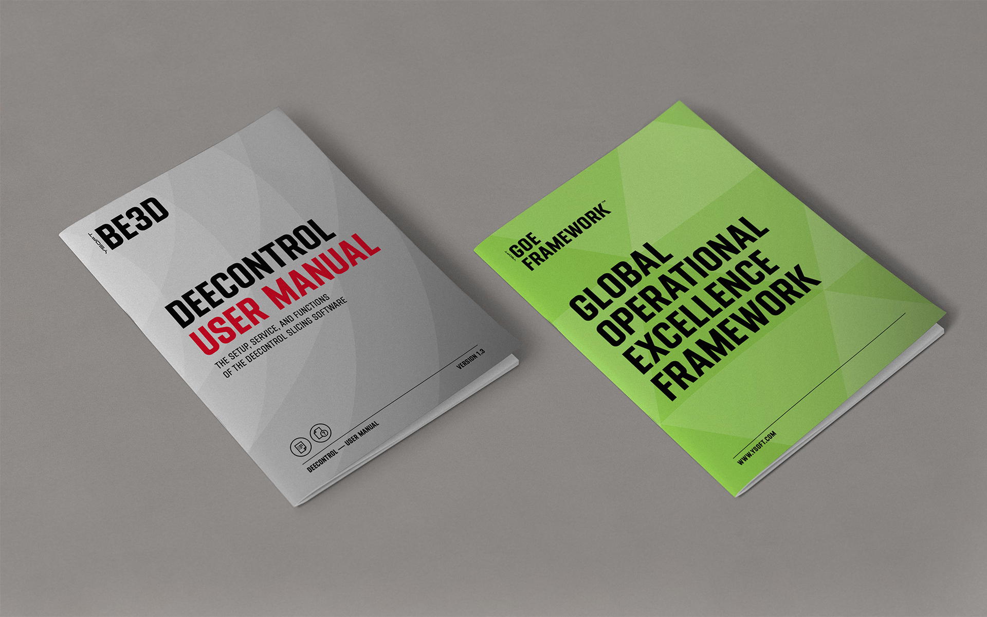
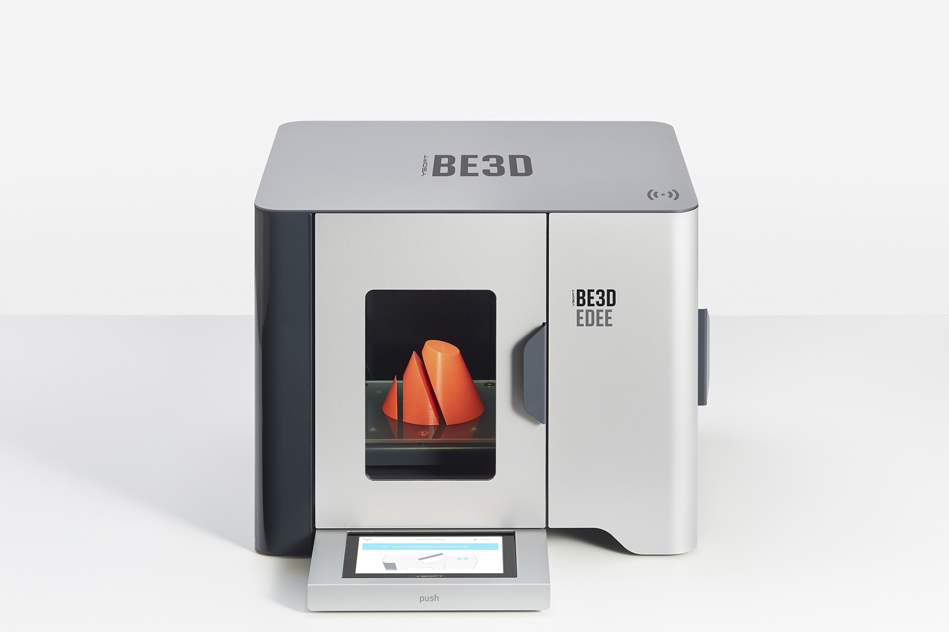
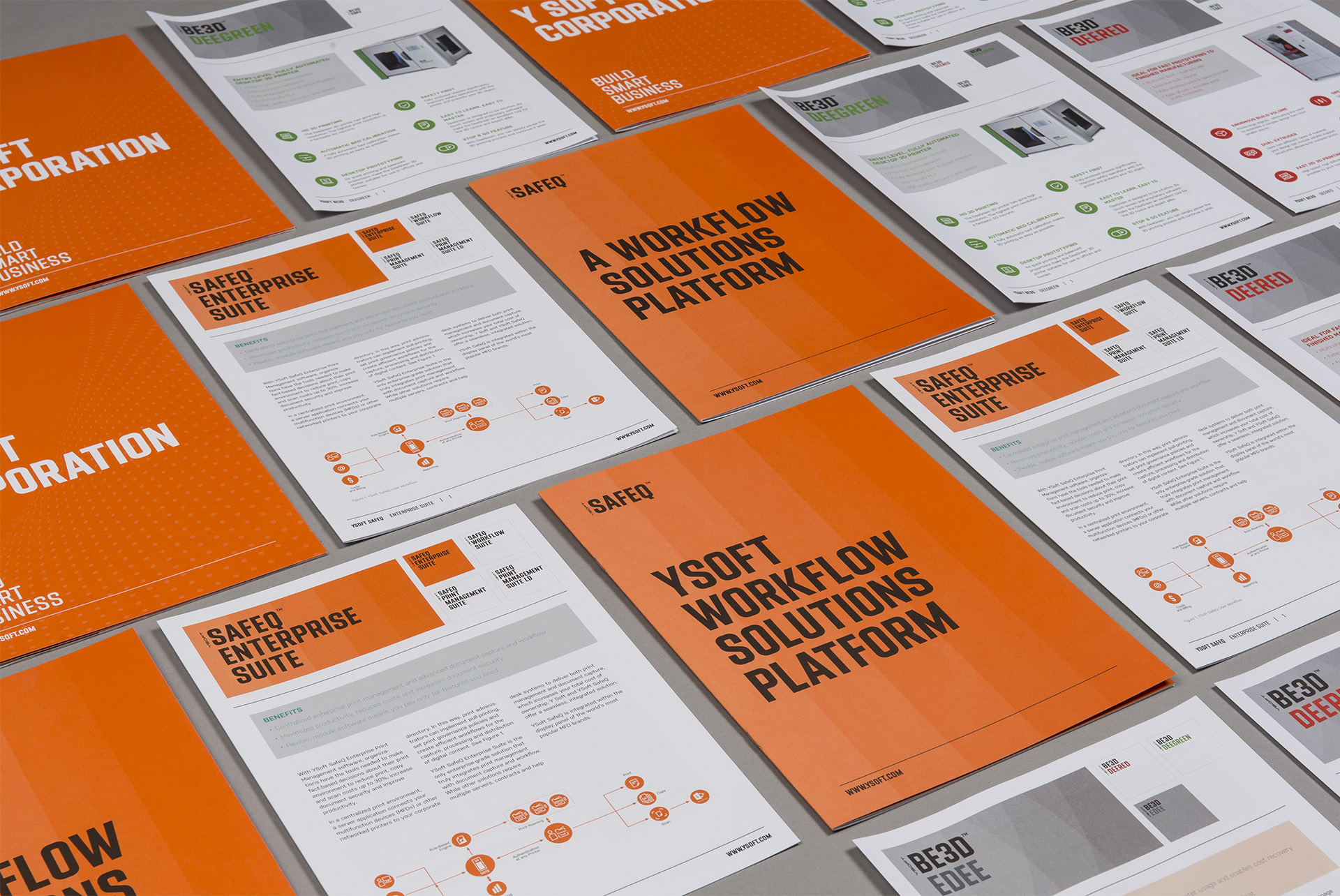
This globally successful manufacturer of software and intelligent office solutions began as a student project on the outskirts of Brno. For the existing Y SOFT logo, which they wanted to keep, we prepared a new visual system with distinctive Pantone 021 orange and variable grid dots in the background. This grid allows high flexibility in both static and animated applications. To unify the design of the product portfolio, we redefined a simple structural principle based on a custom Y Soft font by Tomáš Brousil and a system of geometrically constructed backgrounds. Together with the grid and colour code, this forms a modular system for the entire complex of products and services.
©2016, design by Tibor Vizi, Jiří Toman, Lukáš Müller, animation by Petr Milosh, photo by Filip Györe

Are you interested in this project? Do you need help with design or brand direction? Would you like to create a beautiful book? We want to hear more.
Write to our studio and we’ll get back to you.