Česká Spořitelna Foundation
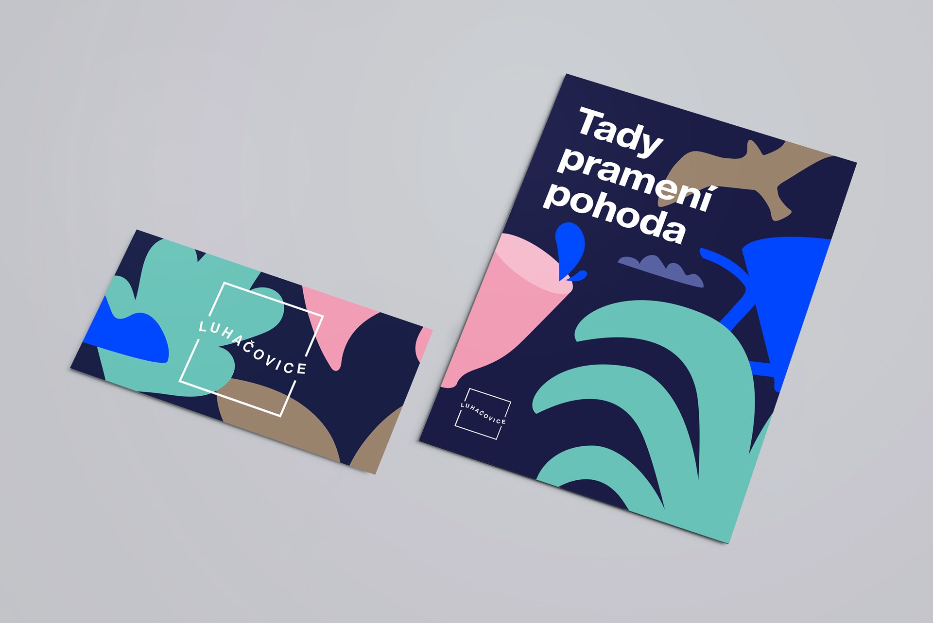
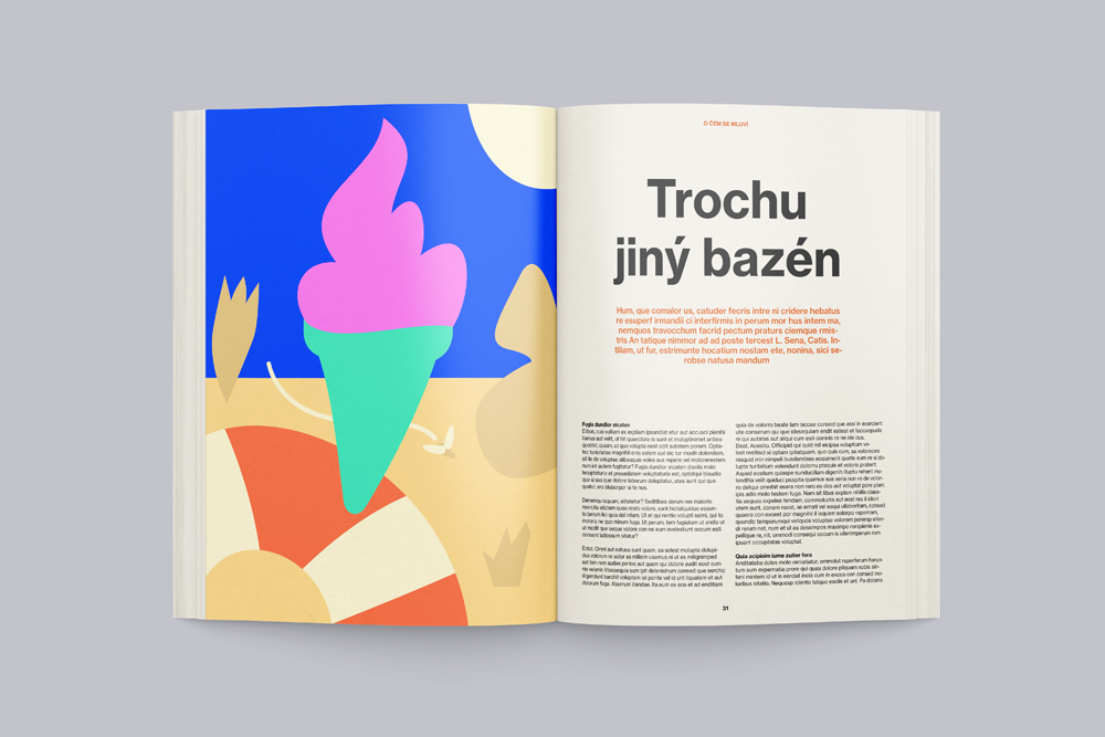
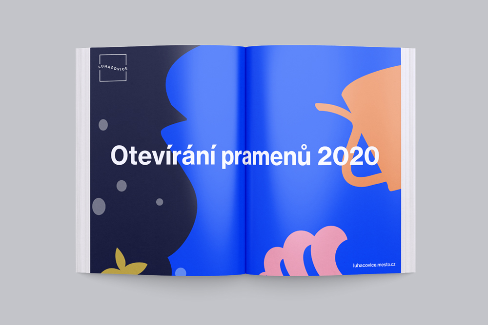
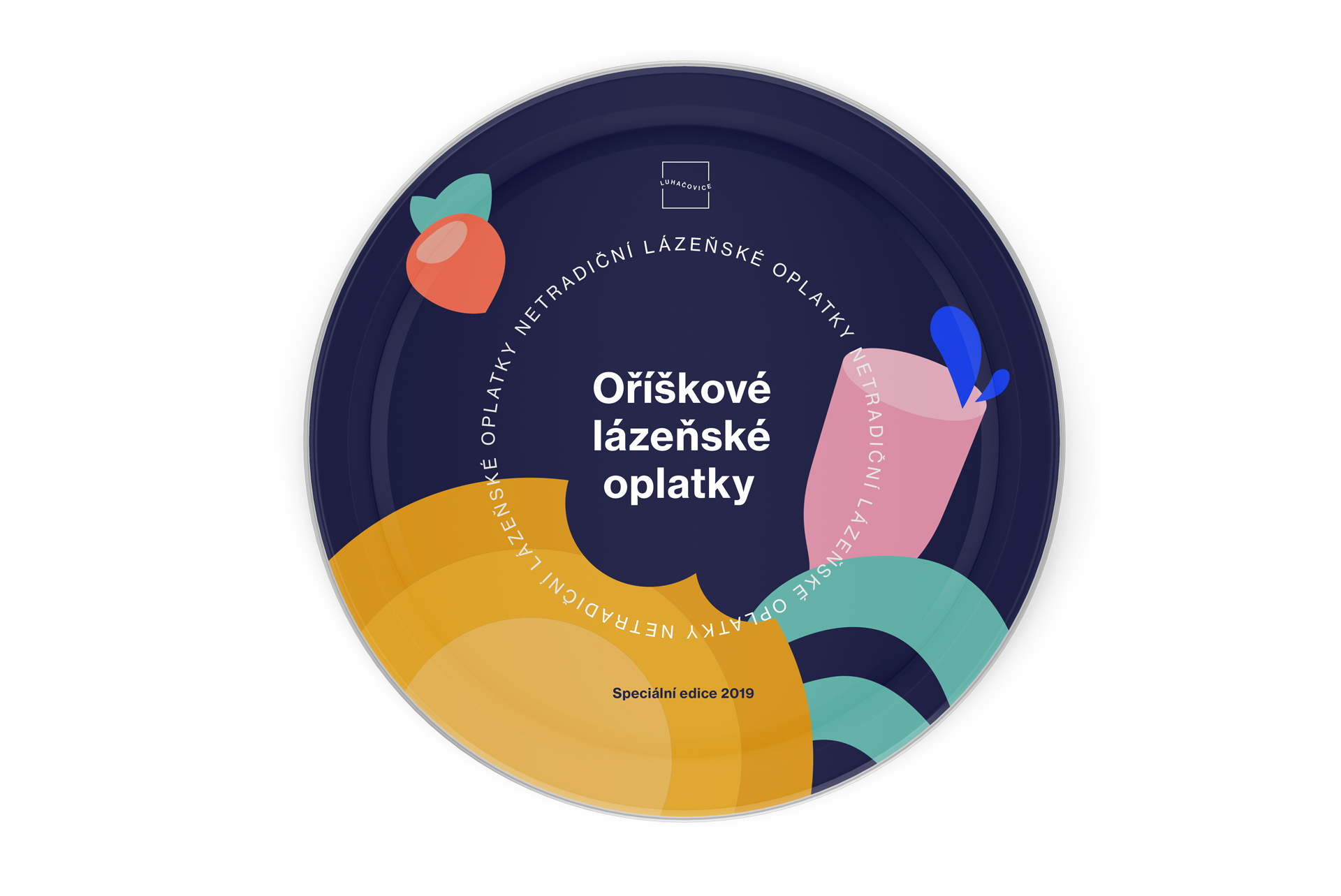
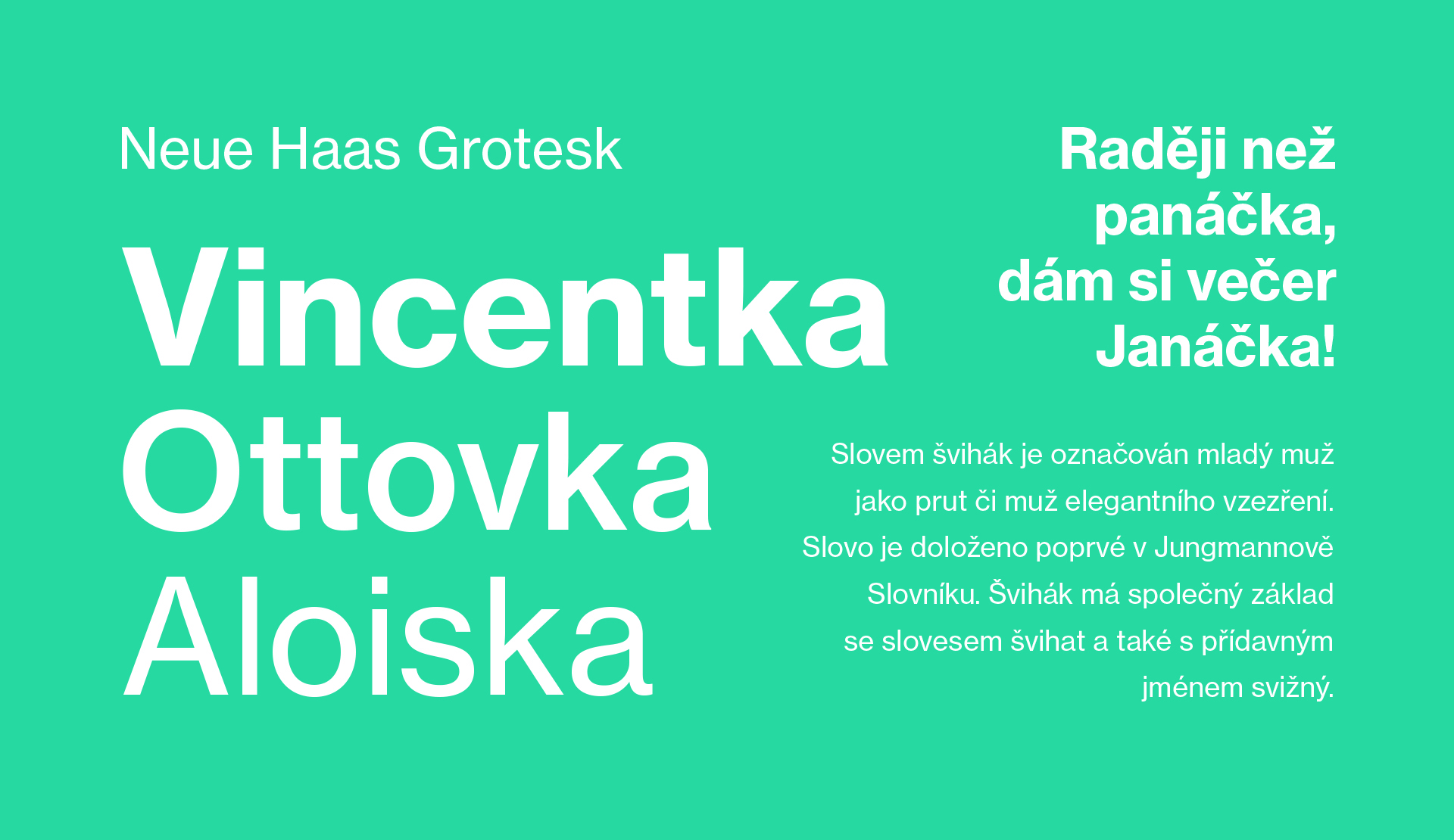
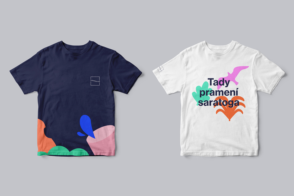
Luhačovice has always been a meeting place, so the new visual style is also based on the symbolic connection of a simple typographic logo and colourful illustrations. The shape of the pantile in the logotype refers to the local landscape and healing springs, as well as to the pleasant atmosphere of the spa town. Illustrated motives playfully personify local icons: traditional architecture, culture, and even a carnival. Do you know what saratoga is?
© 2019, design by Lukáš Müller and Bára Volánková, animation by Petr Milosh, music Sonority
![1_luhacovice_tomandesign_kompozice[1].jpg](/upload/images/1_luhacovice_tomandesign_kompozice[1].jpg)

![8_luhacovice_tomandesign_plakat_ples[1].jpg](/upload/images/8_luhacovice_tomandesign_plakat_ples[1].jpg)

![12_luhacovice_tomandesign_plakaty[1].jpg](/upload/images/12_luhacovice_tomandesign_plakaty[1].jpg)

![14_luhacovice_tomandesign_logo[1].jpg](/upload/images/14_luhacovice_tomandesign_logo[1].jpg)
Are you interested in this project? Do you need help with design or brand direction? Would you like to create a beautiful book? We want to hear more.
Write to our studio and we’ll get back to you.