Business and Administration Centre Borislavka
![boq2[1].jpg](/upload/images/boq2[1].jpg)
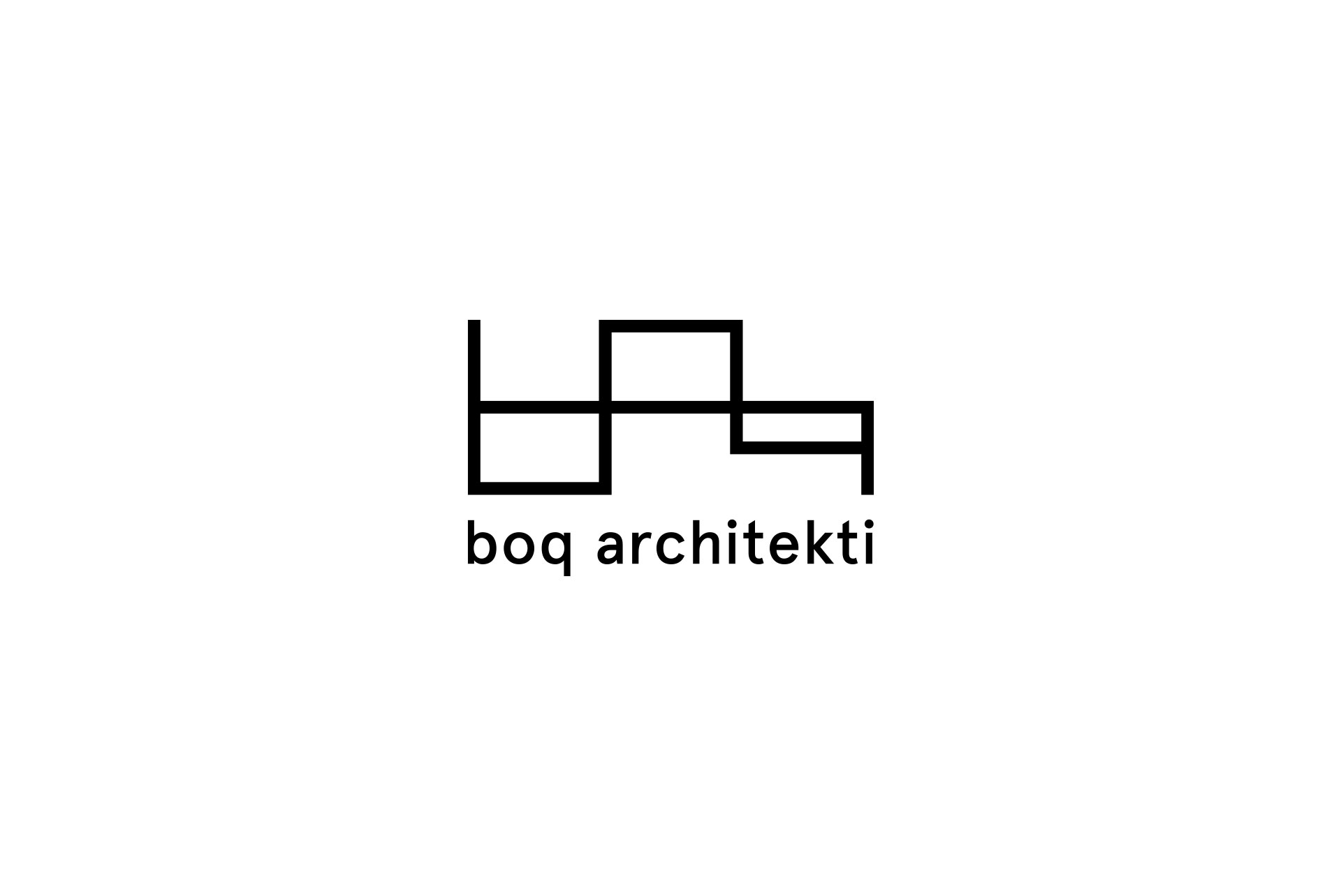
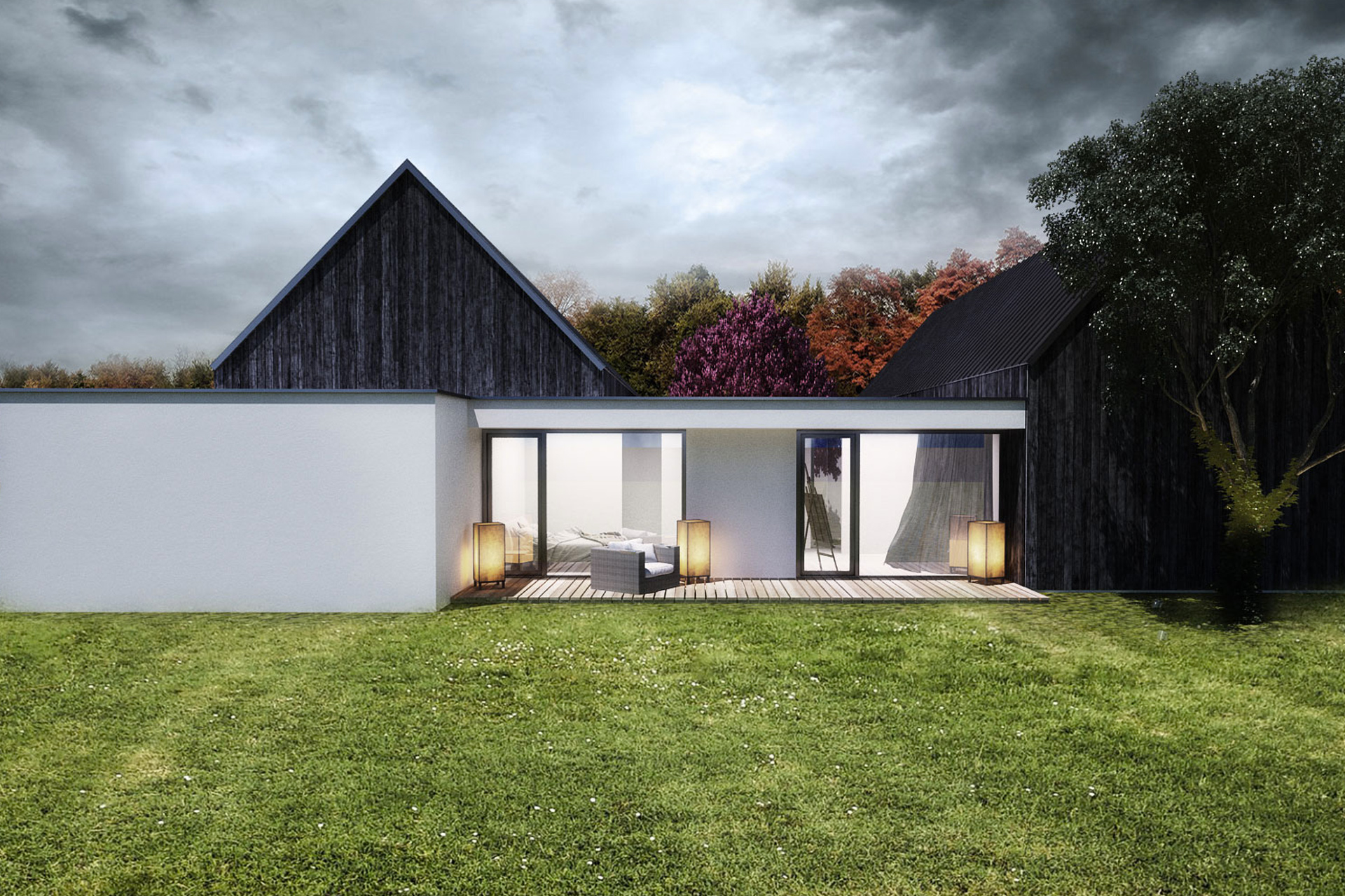
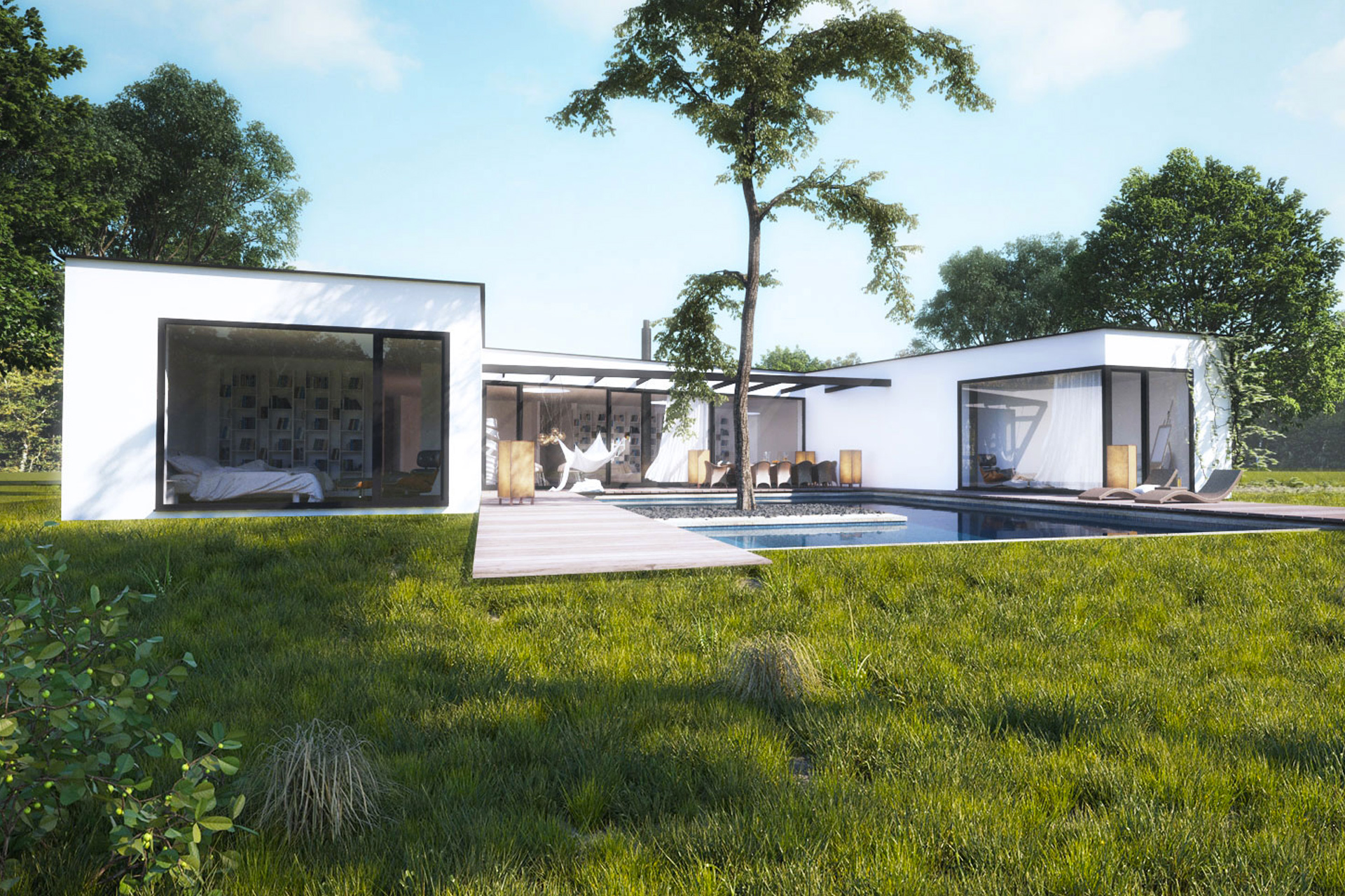
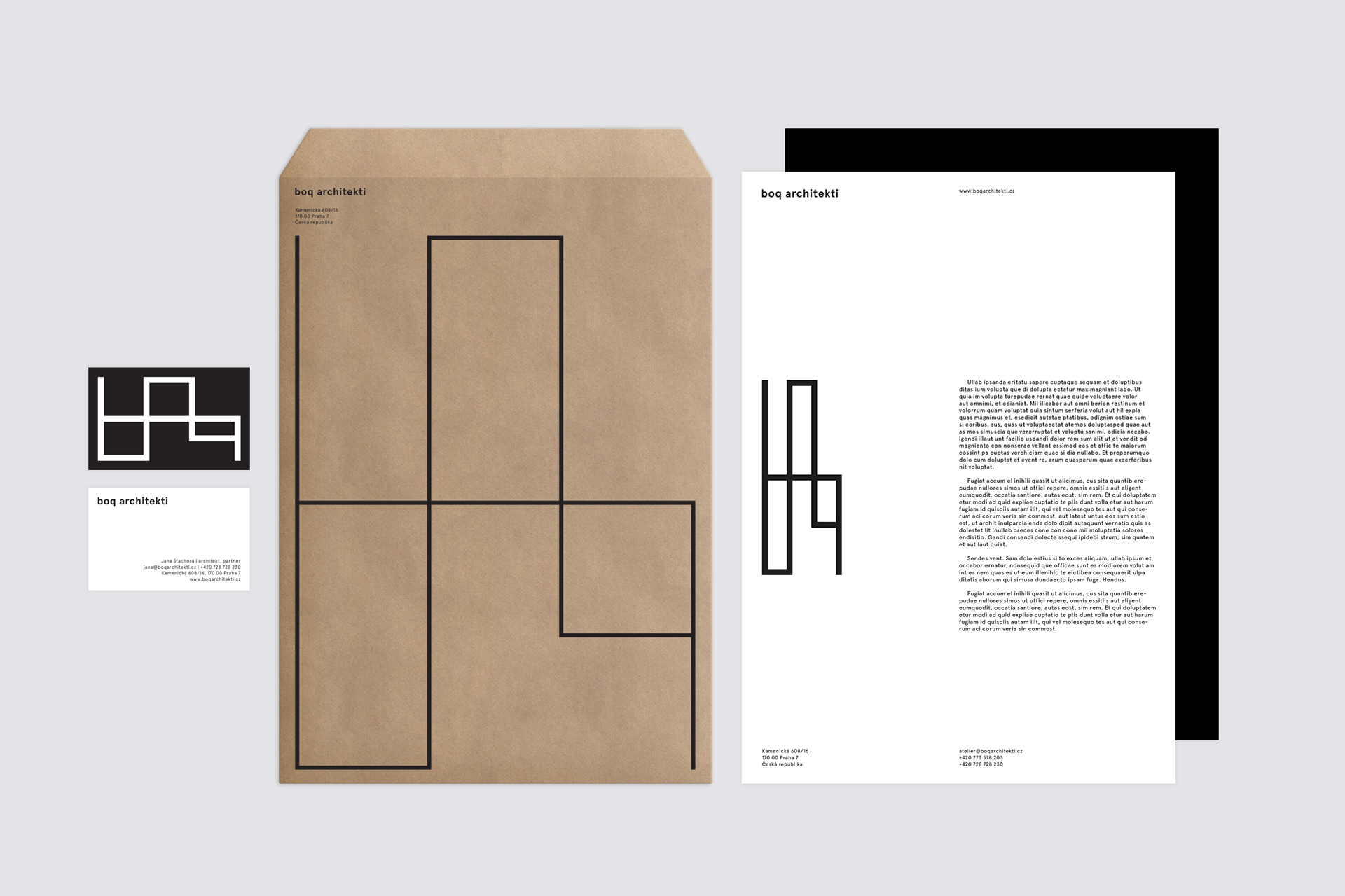
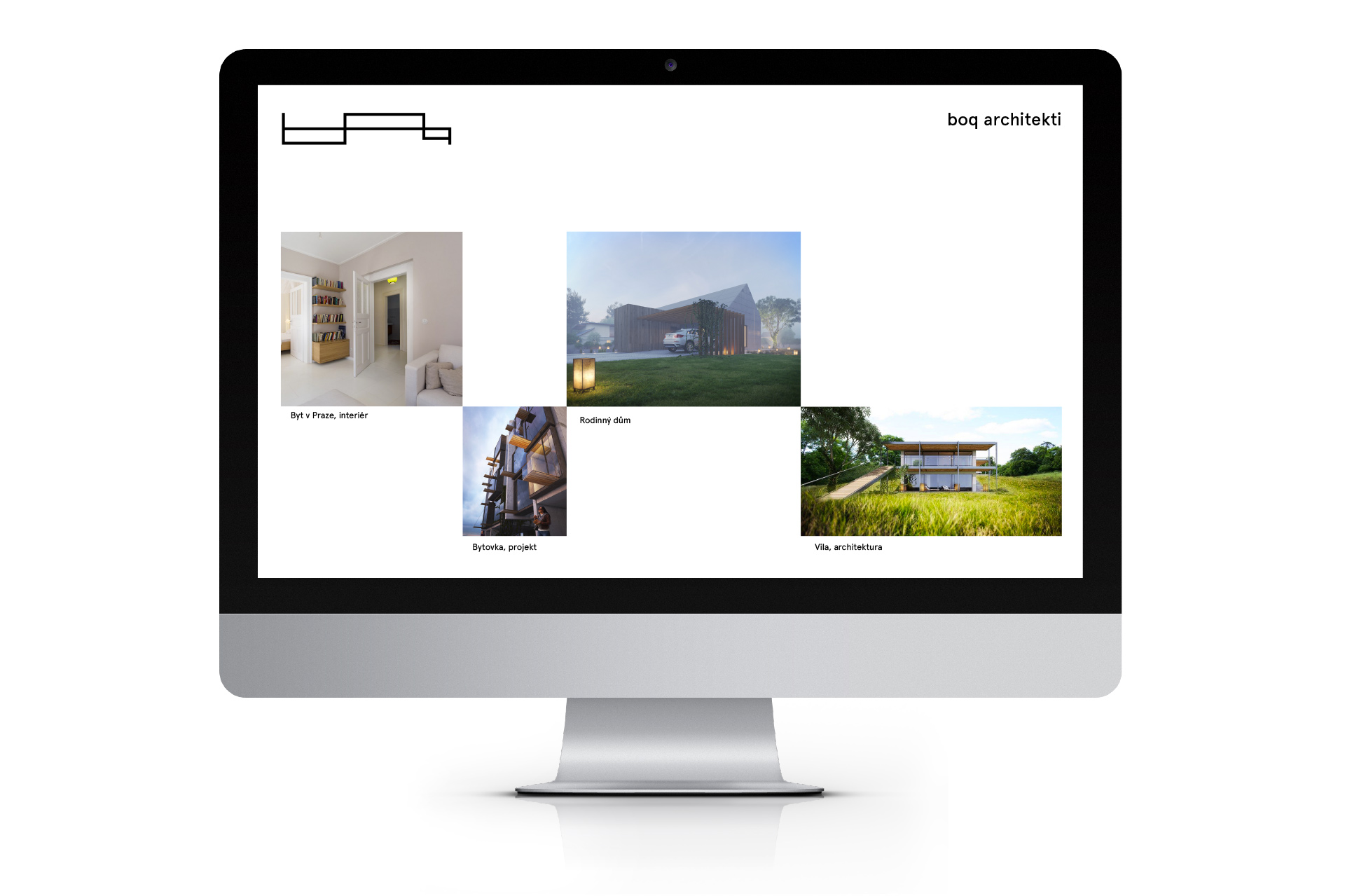
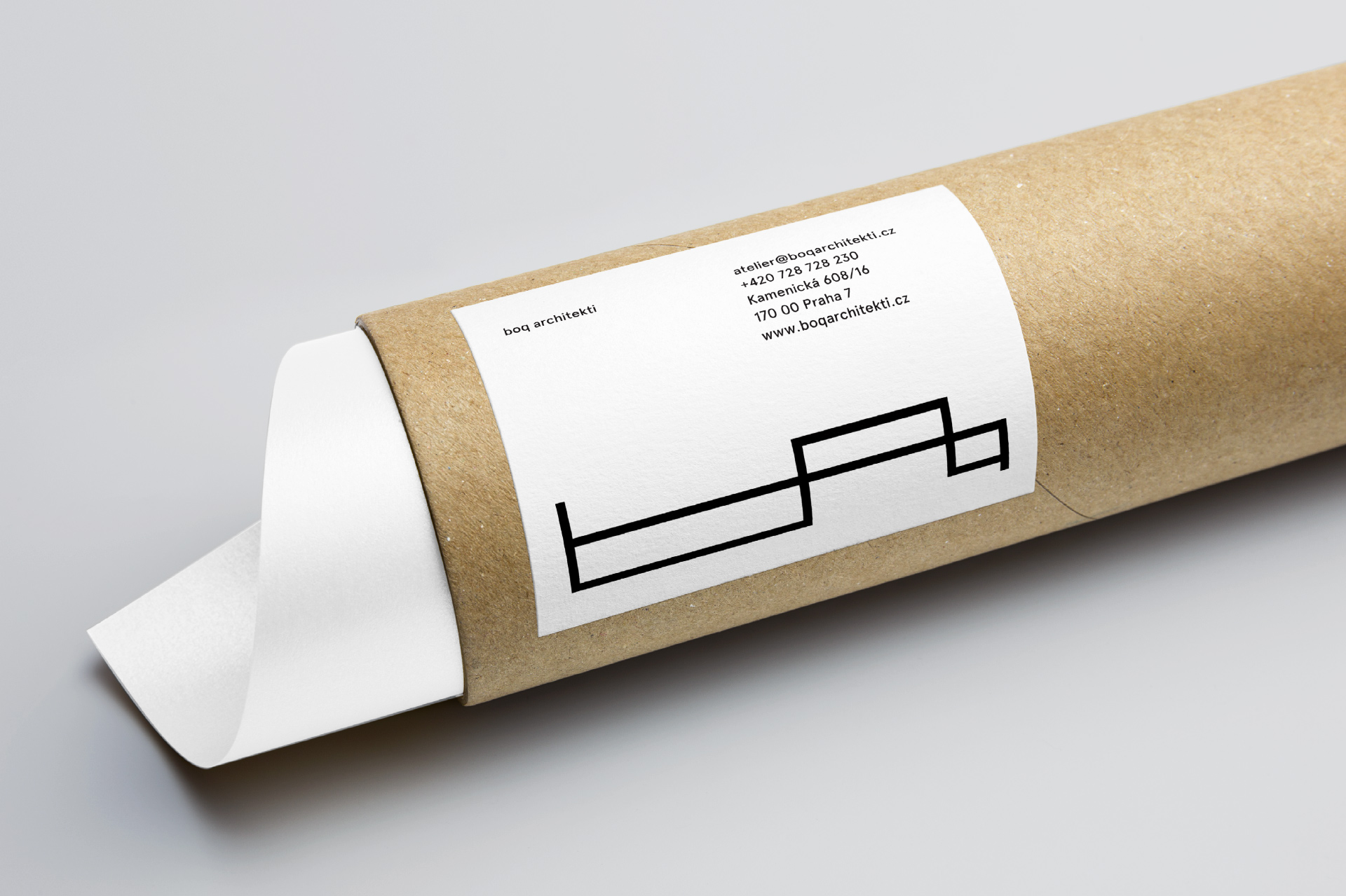
We drew inspiration for the logotype from work with space and layout in the creation of architectural projects. The logotype consists of a symbol and the studio's name. The graphic symbol is an abstract form of the letters "boq", symbolically resembling a floor plan, and it is also based on a family house designed by the client. Evolution and variability are important for the creative work of an architect (or for any creative work). This is why the illustration is modifiable, forming a kind of organic element that changes shape and creates a certain moment of surprise. The system is therefore partly dependent on rules, but there is room for play.
© 2016, design Petr Mazoch, art direction Jiří Toman

Are you interested in this project? Do you need help with design or brand direction? Would you like to create a beautiful book? We want to hear more.
Write to our studio and we’ll get back to you.