Elements
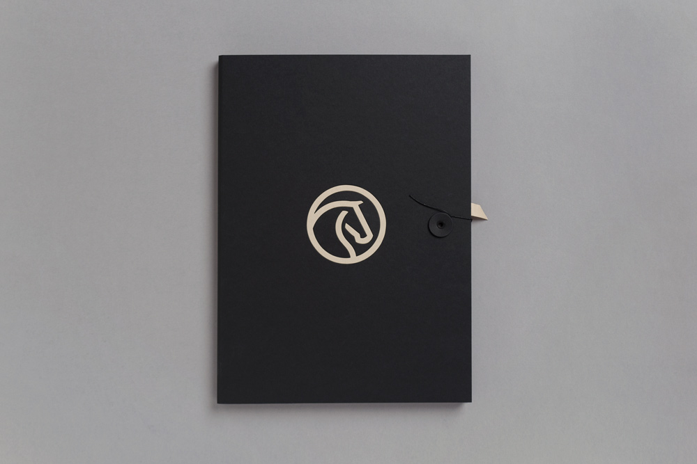
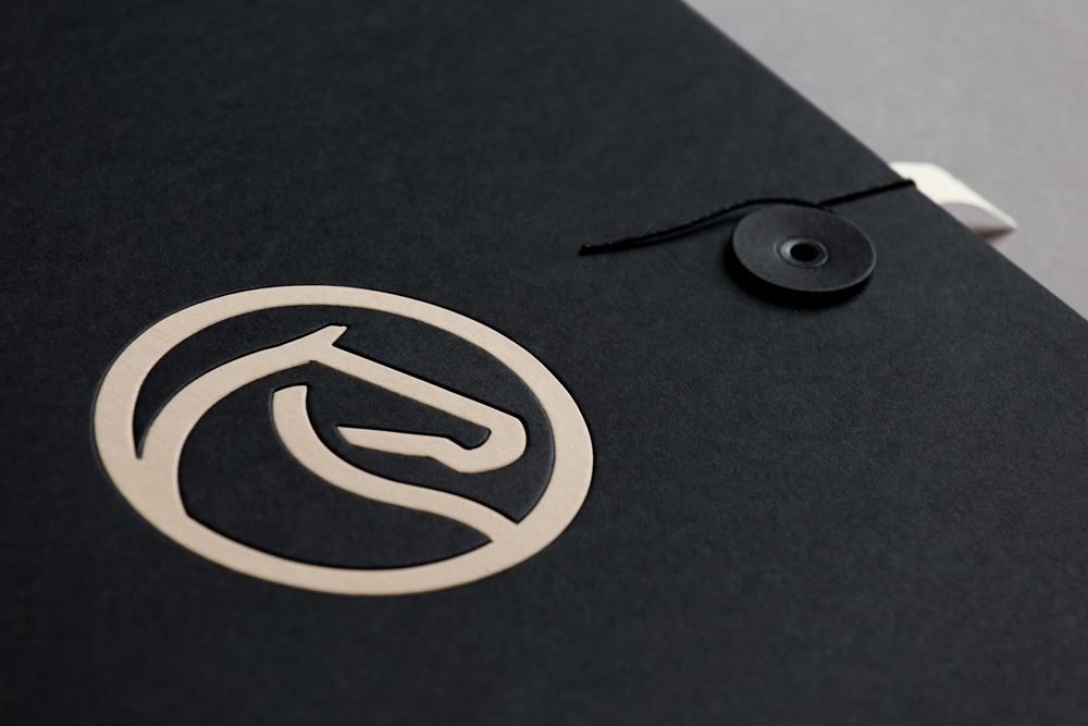
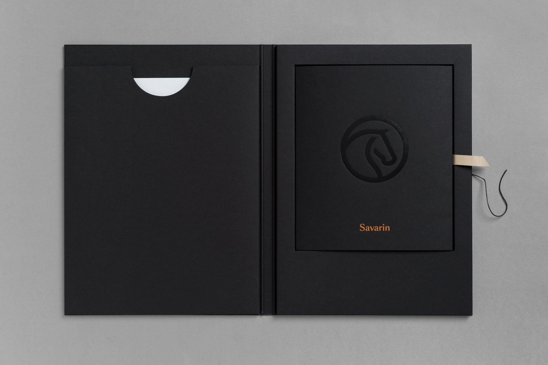
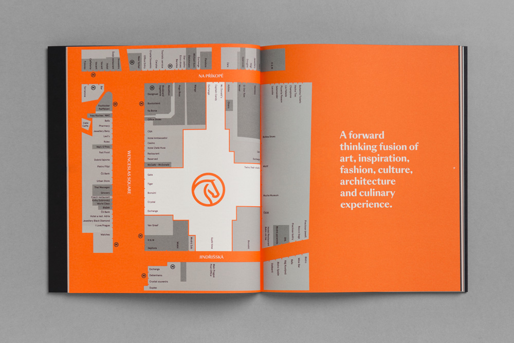
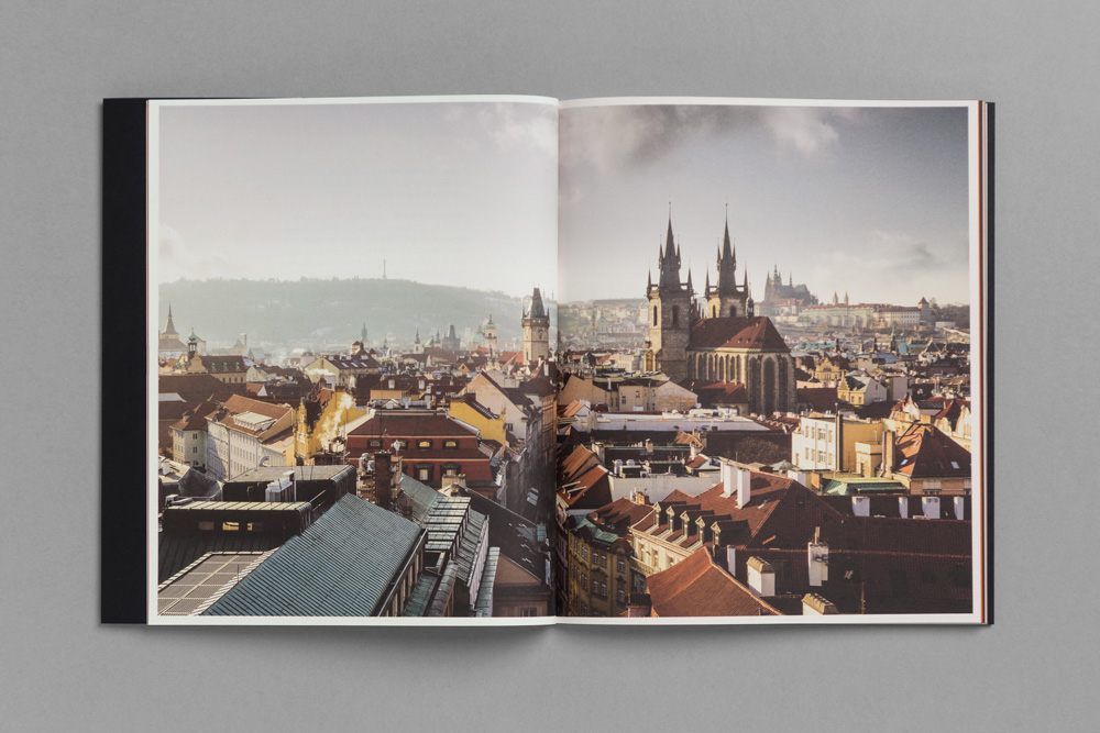
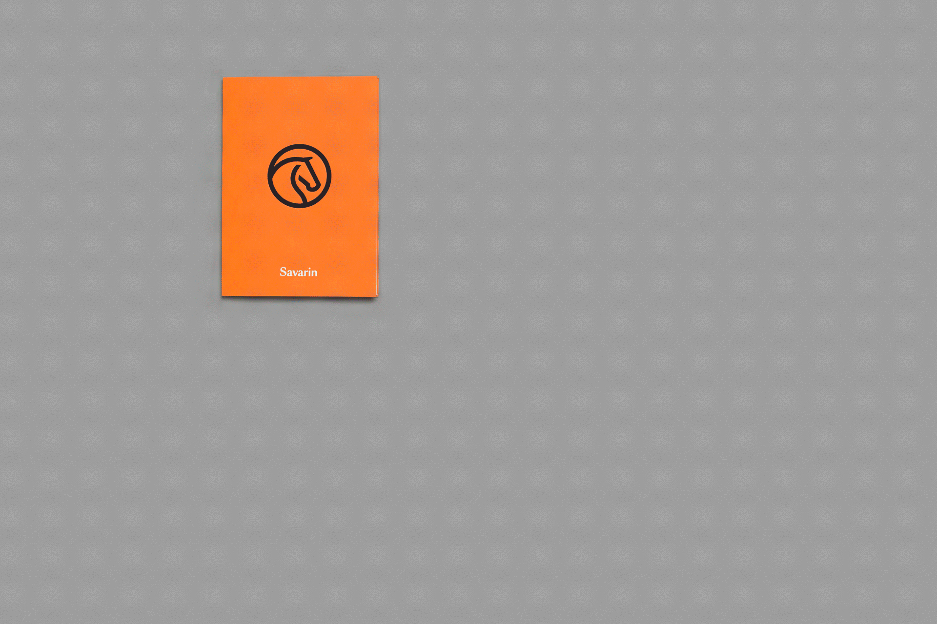
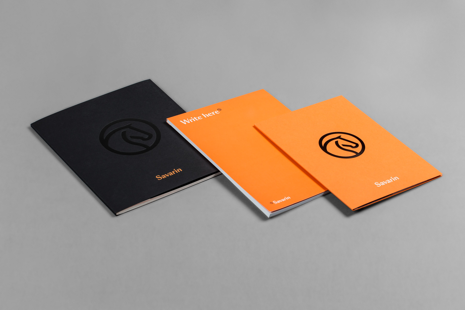
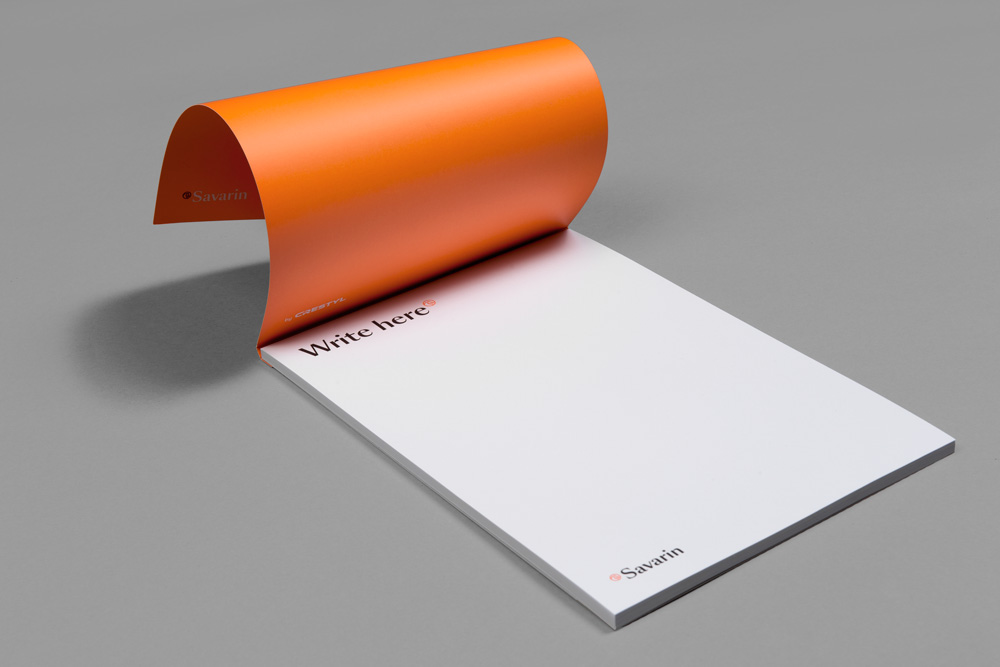
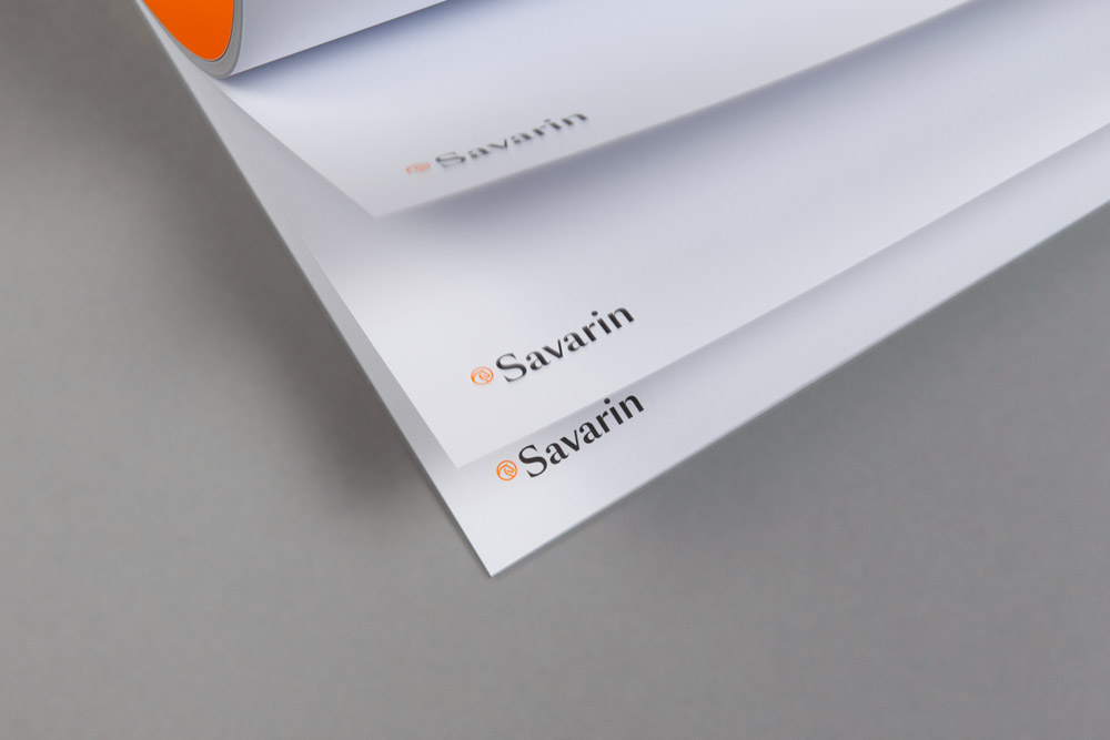
This generous architectural project for the renovation of the Baroque Piccolomini Palace and its surroundings required a high-quality typographic solution. The logo with the SangBleu font from Swiss Typefaces is complemented by an index pictogram of a horse as reference to the preserved historic equestrian facility. The visually strong impression of the new corporate identity is also supported by the fresh orange-black colour. We look forward to making the ambitious project by the iconic London-based Heatherwick studio a reality
© 2016, design by Katka Orlíková, Tibor Vizi, Daniel Quisek, foto by Filip Györe

![_mg_9165[1].jpg](/upload/images/_mg_9165[1].jpg)


Are you interested in this project? Do you need help with design or brand direction? Would you like to create a beautiful book? We want to hear more.
Write to our studio and we’ll get back to you.