Birth of an Artist from the Lemonade Foam
![img_0020_1920[1].jpg](/upload/images/img_0020_1920[1].jpg)
Josef Čapek is undoubtedly a key figure in Czech modern art, but his work was not systematically recorded until the end of the twentieth century.
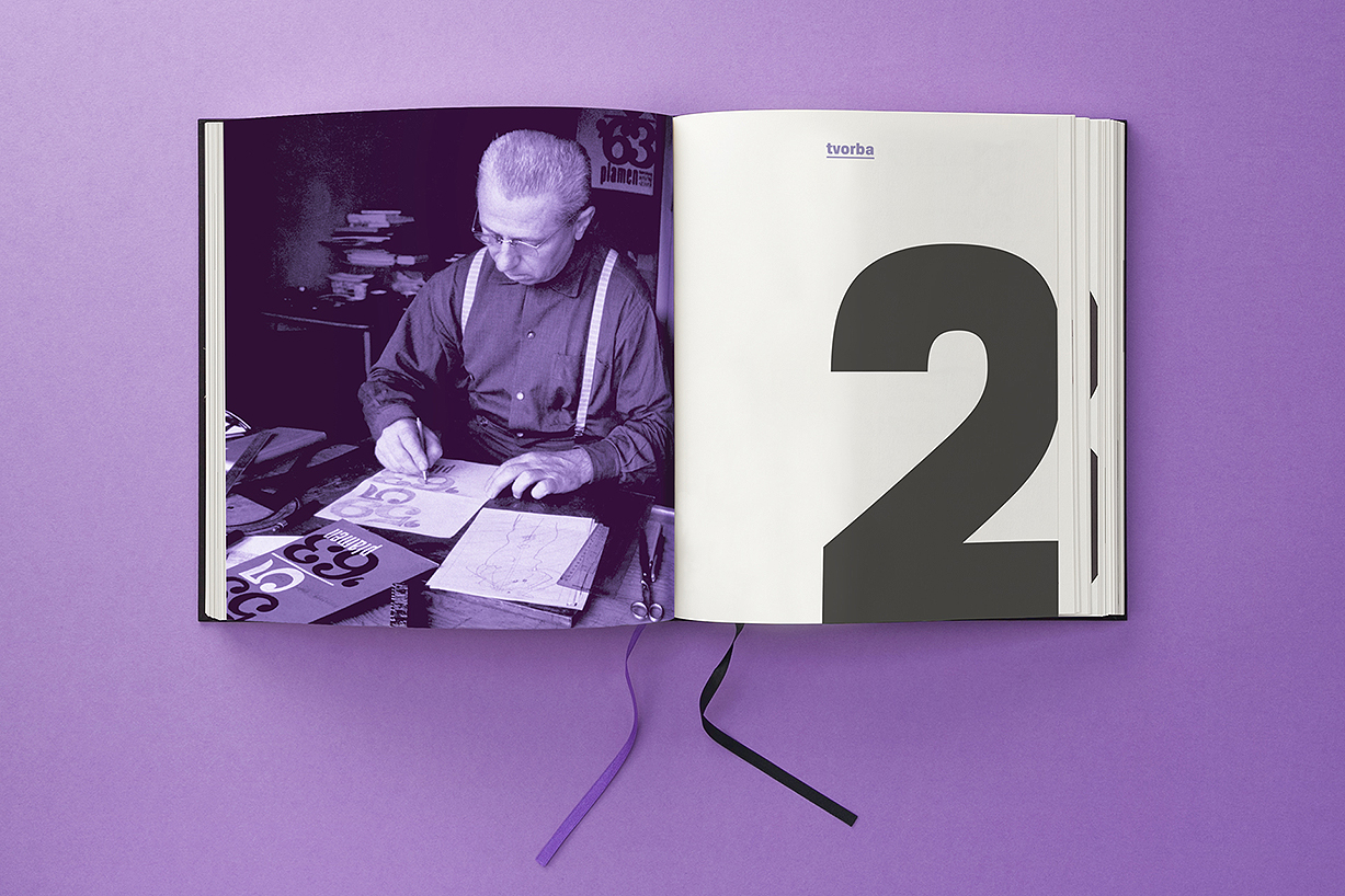
The book project titled "Pracoval jsem mnoho" (I worked a lot) aims to publish a complete catalogue of original art works by Josef Čapek. The catalogue is divided into four volumes, which will be gradually published in the years 2019–2023. The first volume is devoted to freehand drawing, the second volume contains applied art work, illustrations, caricatures and scenographic designs, the third focuses on painting, and the fourth volume maps his graphic works. This forms a unique inspirational gallery that stands out among ordinary books on works of art. The author of the project, Pavla Pečinková, has been studying Čapek's work systematically since the 1980s. This collector's book series is published by the Osmička publishing house and gallery.
© 2019, concept and design by Barbora Toman Tylová, Tibor Vizi, layout and retouching by Marek Šmidrkal, photo by Filip Šach

![img_0005_1920[1].jpg](/upload/images/img_0005_1920[1].jpg)
![img_0007_1920[1].jpg](/upload/images/img_0007_1920[1].jpg)
![img_0013_1920[1].jpg](/upload/images/img_0013_1920[1].jpg)
![img_0017_1920[1].jpg](/upload/images/img_0017_1920[1].jpg)


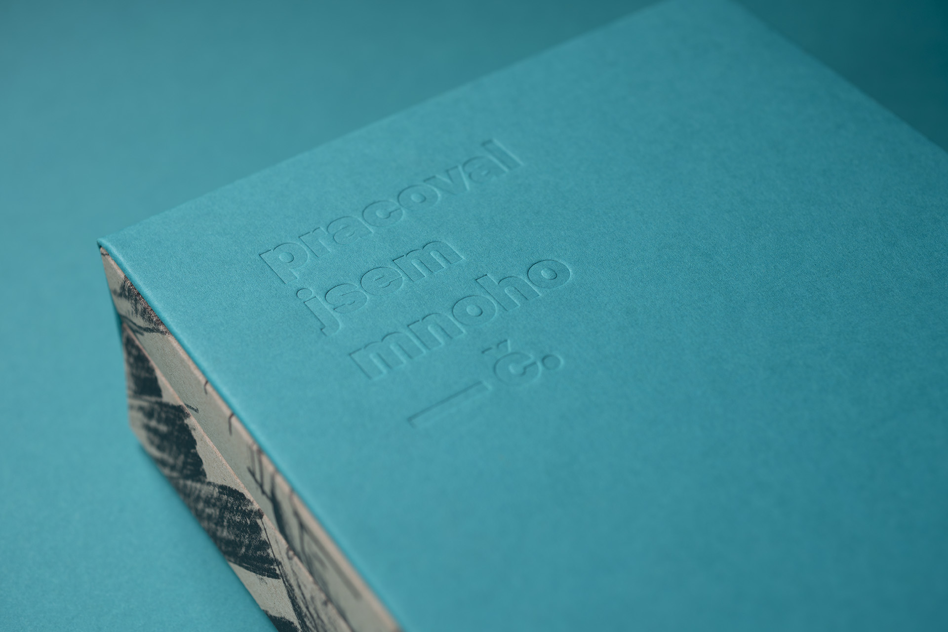
"After all, what other than man is the subject of all art?" Čapek's approach to his own work became the visual motto of the graphic design. The size of the book format, careful selection of quality structural elements of the book such as the font, paper, the blind stamp on the case, embossing on the cover. Valuable but modest, simple and clean.
![img_0006_variantab_1920[1].jpg](/upload/images/img_0006_variantab_1920[1].jpg)


![img_0027_1920[1].jpg](/upload/images/img_0027_1920[1].jpg)
![img_0026_1920[1].jpg](/upload/images/img_0026_1920[1].jpg)
![img_0030_1920[1].jpg](/upload/images/img_0030_1920[1].jpg)

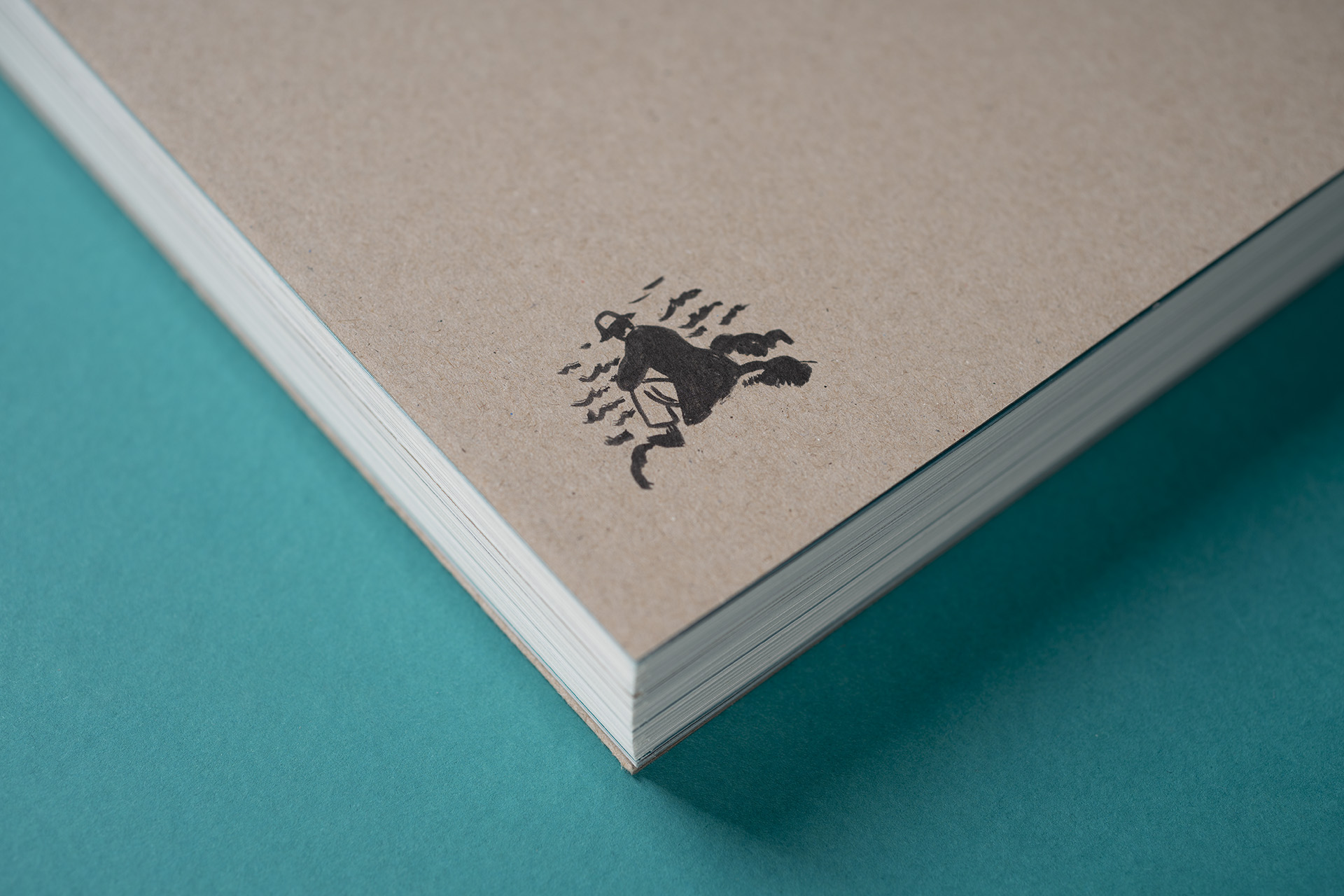
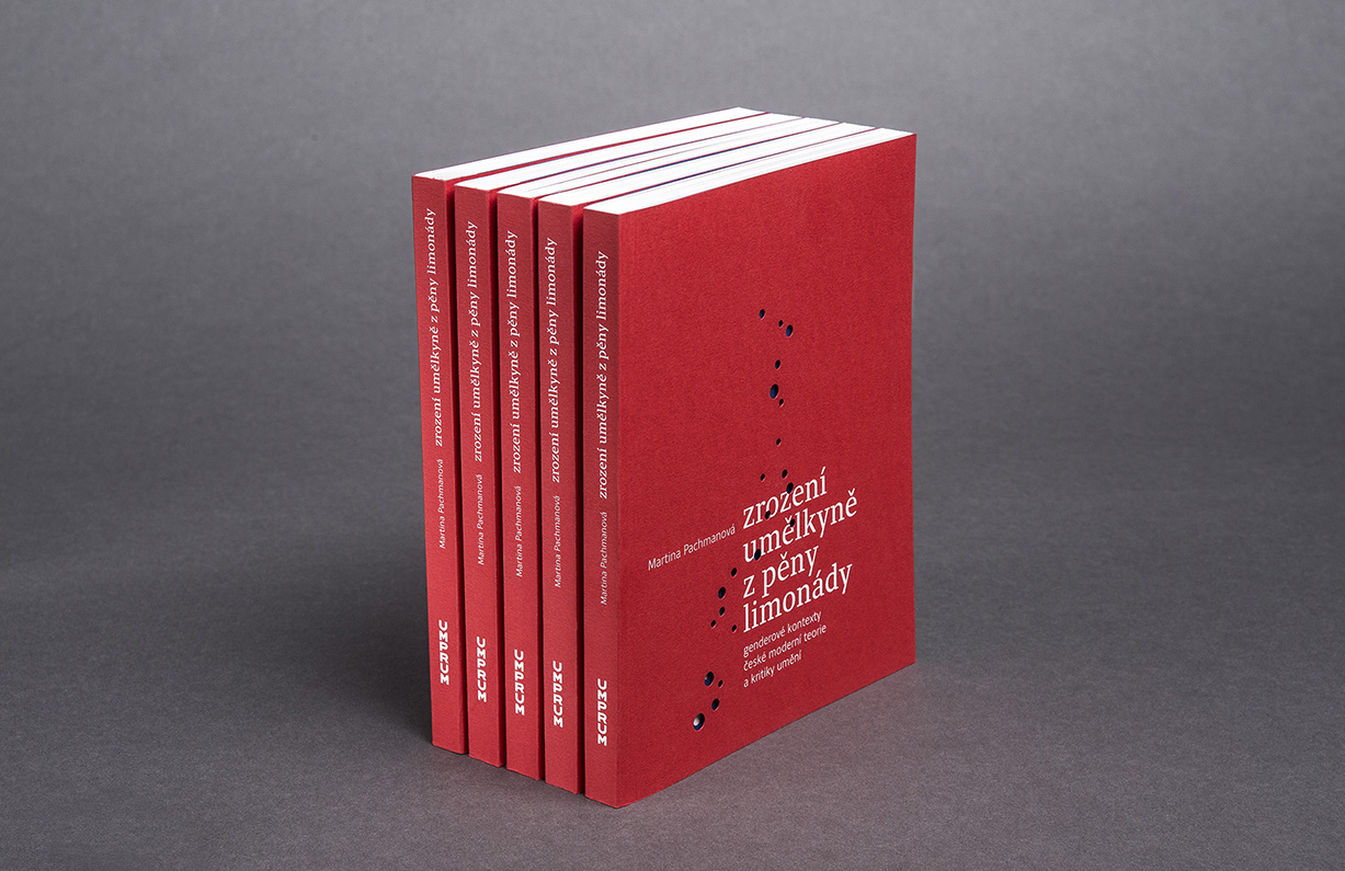
For the convenience of the reader, each volume is divided into two more volumes - the text and the catalogue. The extensiveness of both books resulted in a large book spine, each of which contains a black and white image by Čapek representing the theme of the volume. This black and white image serves as a clear and immediate point of orientation and a distinctive decoration in the library. There is no need for additional typography. Part of the black and white drawing/caricature/painting/graphic art from the spine flows freely onto the cover, where it is hidden by the pull-out case. At first glance, the book case is only typographically decorated. The principle of pull-out pages is interwoven throughout the book.
![img_0033_1920[1].jpg](/upload/images/img_0033_1920[1].jpg)

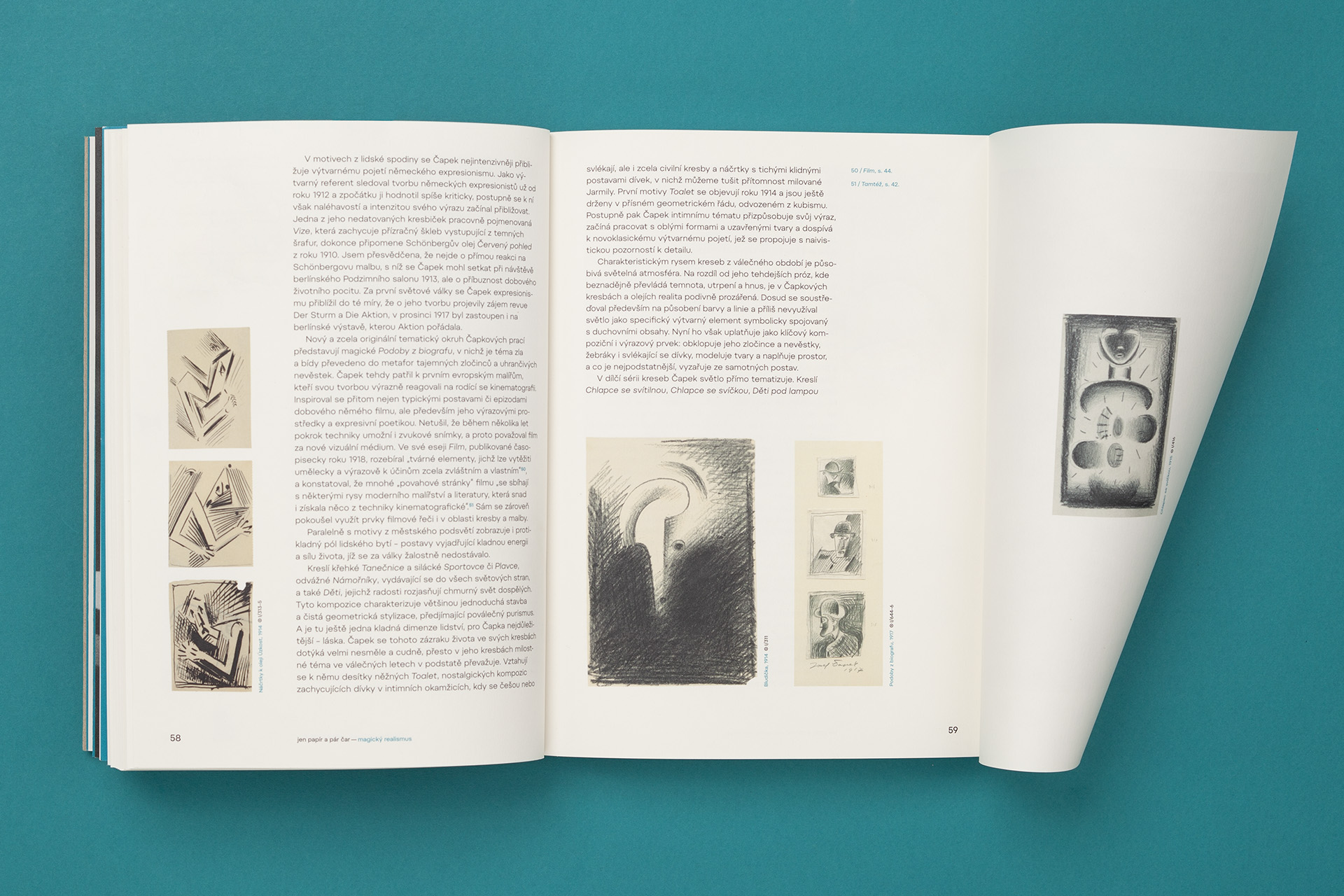
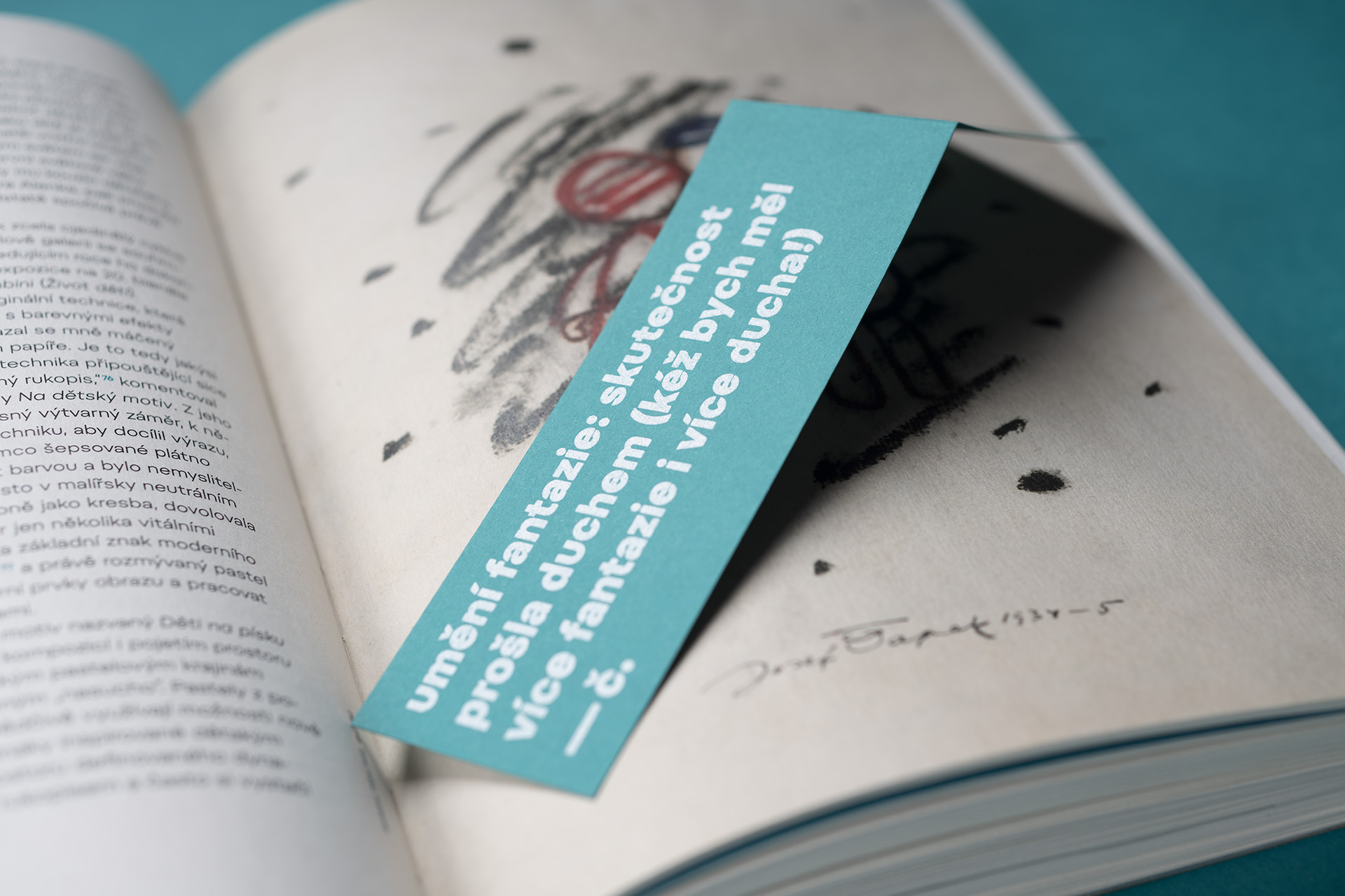
In each volume, the catalogue with colour images of individual works is accompanied by a strip of images with full-page reproductions of selected works and a monograph essay. Each volume is framed by a coloured paper case. The colour of the case is the colour of the entire volume. Čapek's quotes are another distinctive graphic element, which separate the individual chapters and foreshadow their theme. Each quote ends with the signature -č., like the one on the case.

Are you interested in this project? Do you need help with design or brand direction? Would you like to create a beautiful book? We want to hear more.
Write to our studio and we’ll get back to you.