Josef Čapek, Pracoval jsem mnoho I.
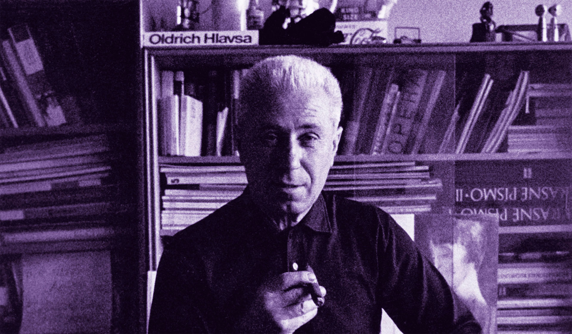
The book titled "The Point is to Make a Point, Typographer Oldřich Hlavsa" is the first to comprehensively presents the extensive work of typographer and graphic designer Oldřich Hlavsa (1909-1995), an author whose work forms a crucial chapter in the history of Czech graphic design of the second half of the 20th century. The exceptional quality of Hlavsa's work has been repeatedly rewarded with many prestigious domestic and international awards. Yet, his wide-ranging work has not been systematically explored and documented until the publication of this book.
© 2015, Monograph Editor Barbora Toman Tylová, text by Iva Knobloch, Jan Rous, Barbora Toman Tylová, lecturers Polana Bregantová and Pavla Pečinková, bibliographies and drawings by Barbora Toman Tylová with the contribution of Josef Schwarz, graphic design by Barbora Toman Tylová, Coridor font by Signaturetype, retouching and preparation of reproductions by Jiří Toman, original pictures in the book by Filip Šach, photo publication for the web by Filip Šach, Filip Györe.
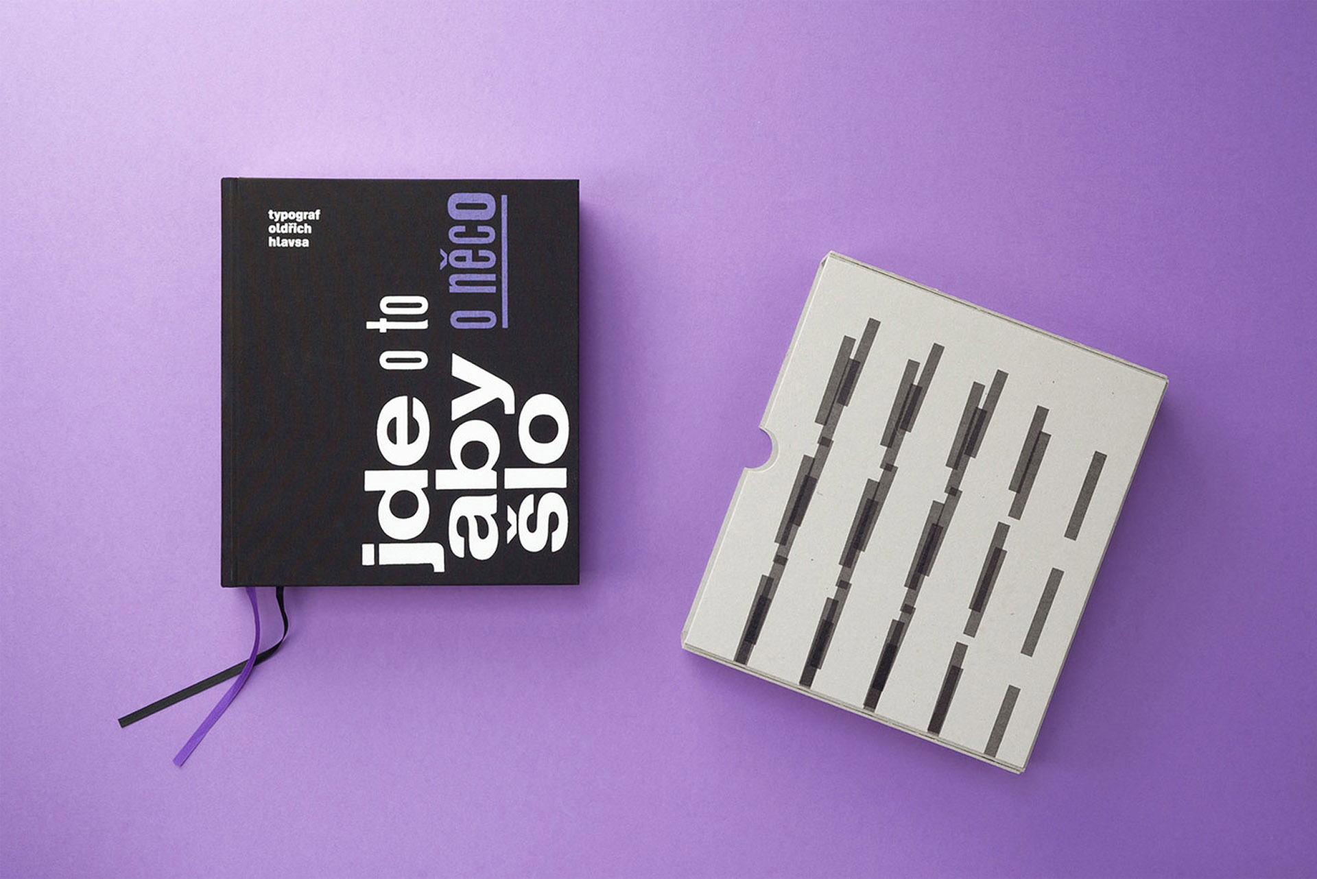
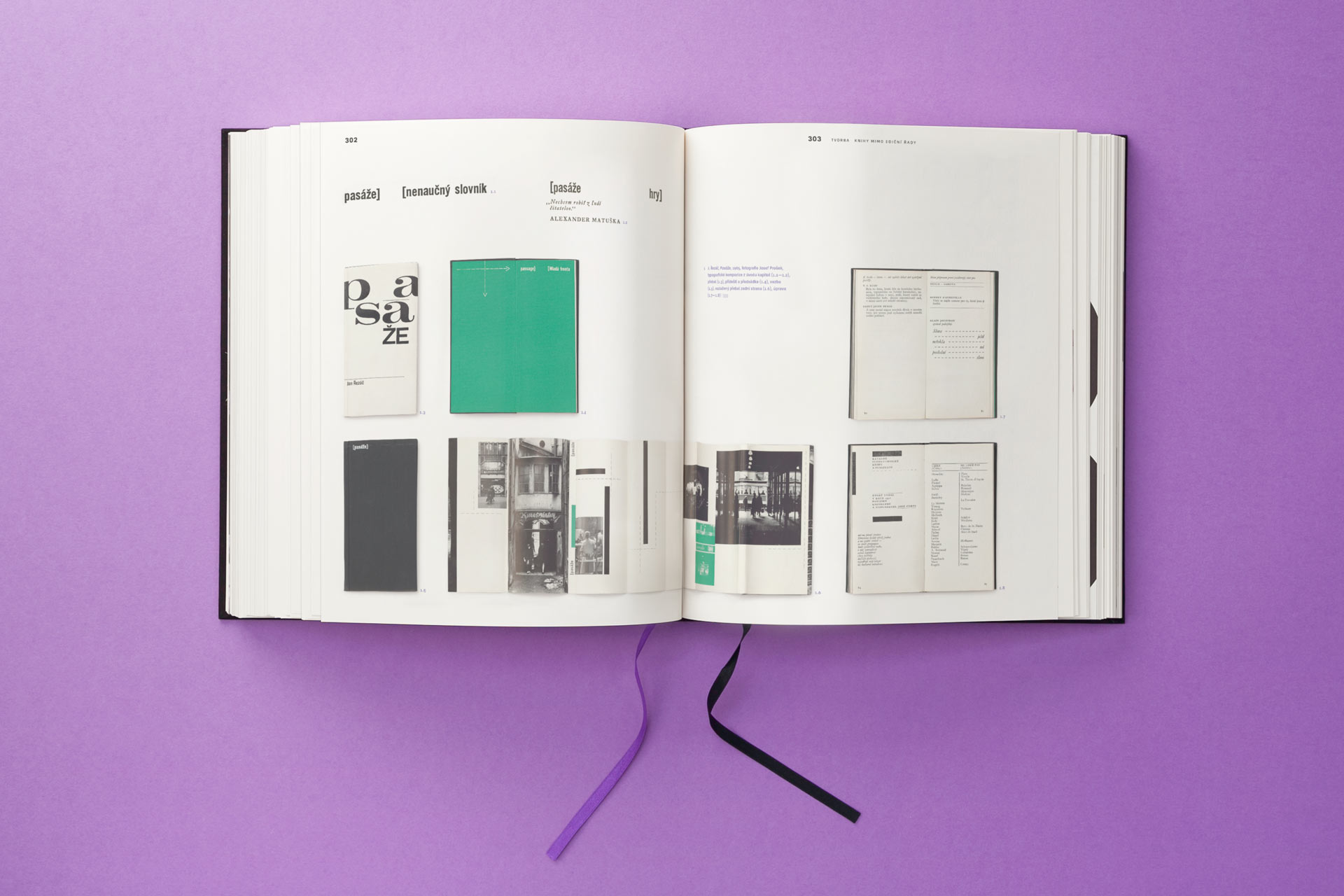
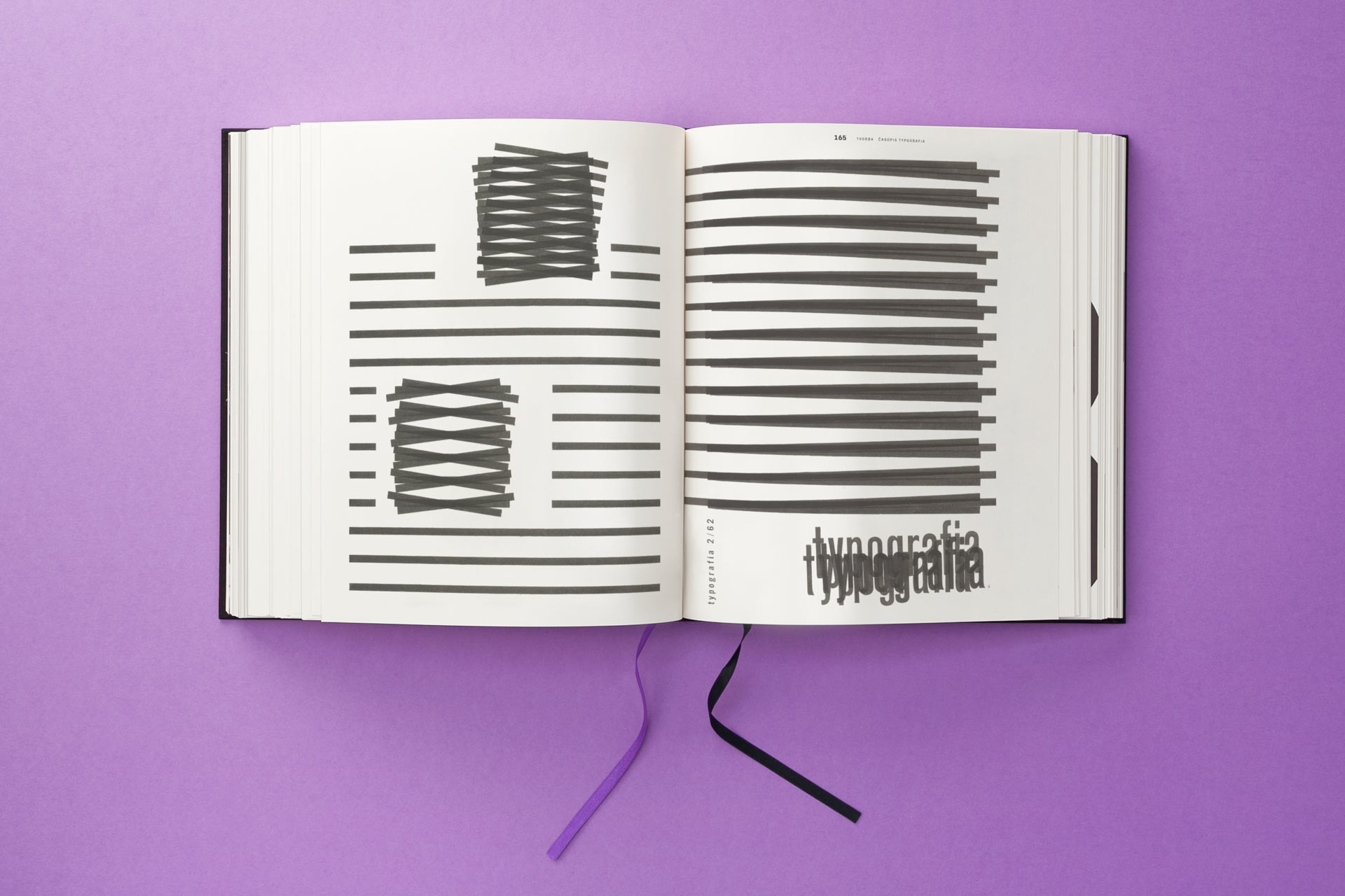
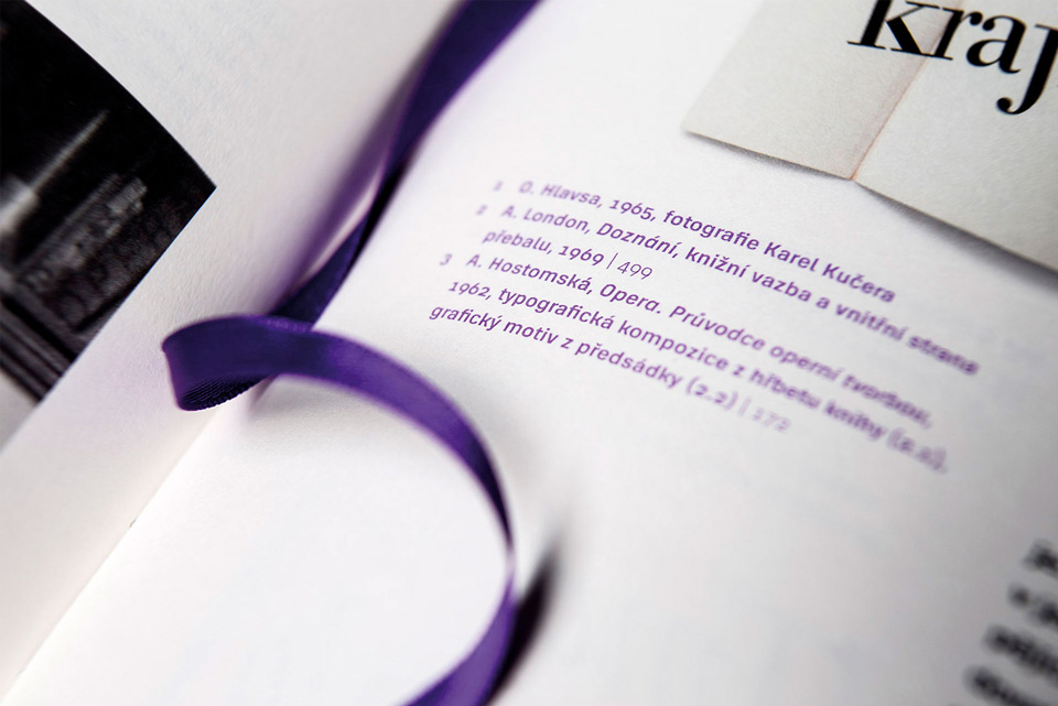
Driven by passion, need and true zeal for Hlavsa's work and typographical experiments, Barbora Toman Tylová initiated and finally compiled and graphically designed Hlavsa's first ever monography after five years of intensive work (there was also a bit of naivety and madness involved). It has 592 pages, weighs almost 4 kilograms and contains around 2 000 reproductions. The monograph consists of Hlavsa's complete biography, original text studies, extensive indexes and a selection from his correspondence. A website was specially created for the book at ww.oldrichhlavsa.cz
Presenting books through the medium of photography is just half of the experience, which is why the book contains a pocket in which the reader will find Hlavsa’s original New Year’s cards, faithfully re-printed, allowing the reader to actually touch Hlavsa's typography.
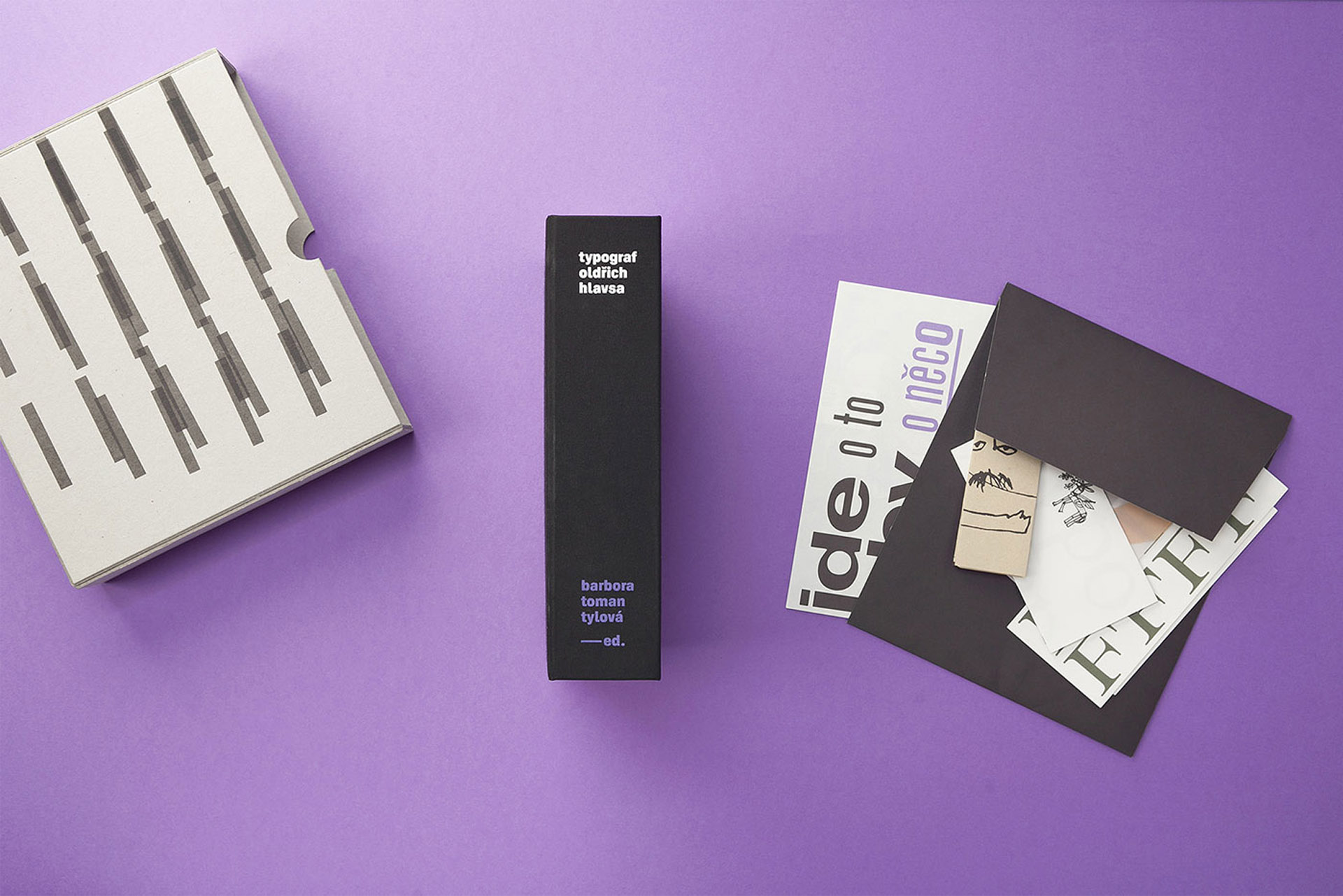
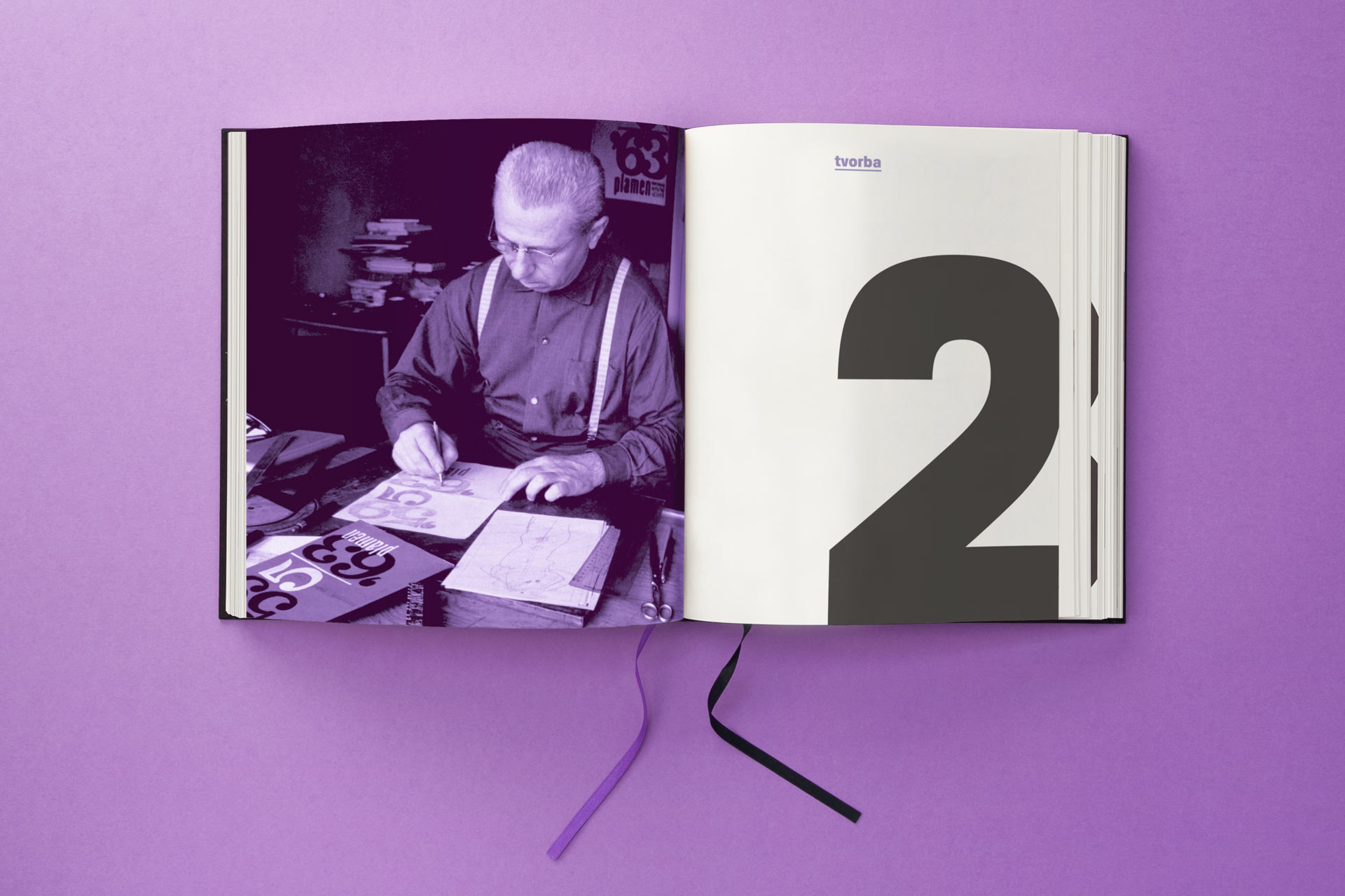
The layout is simple, clear and functional. The intent was to display Hlavsa's vibrant experimental designs while combining a large amount of diverse materials. However, it also reflects the character of Hlavsa's work with the use of large digits at the beginning of individual chapters, or with reprinted hand-written notes. The book is printed on two types of top-quality Fedrigoni paper, and the typesetting uses the brilliant Corridor font by Signature Type Foundry.
![14-960[1].jpg](/upload/images/14-960[1].jpg)

![_mg_3902[2].jpg](/upload/images/_mg_3902[2].jpg)


![_mg_3914_2_flat[2].jpg](/upload/images/_mg_3914_2_flat[2].jpg)

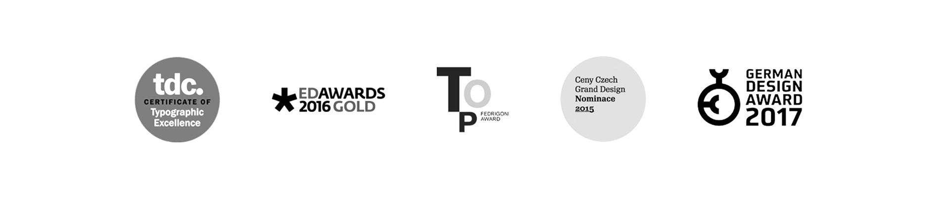
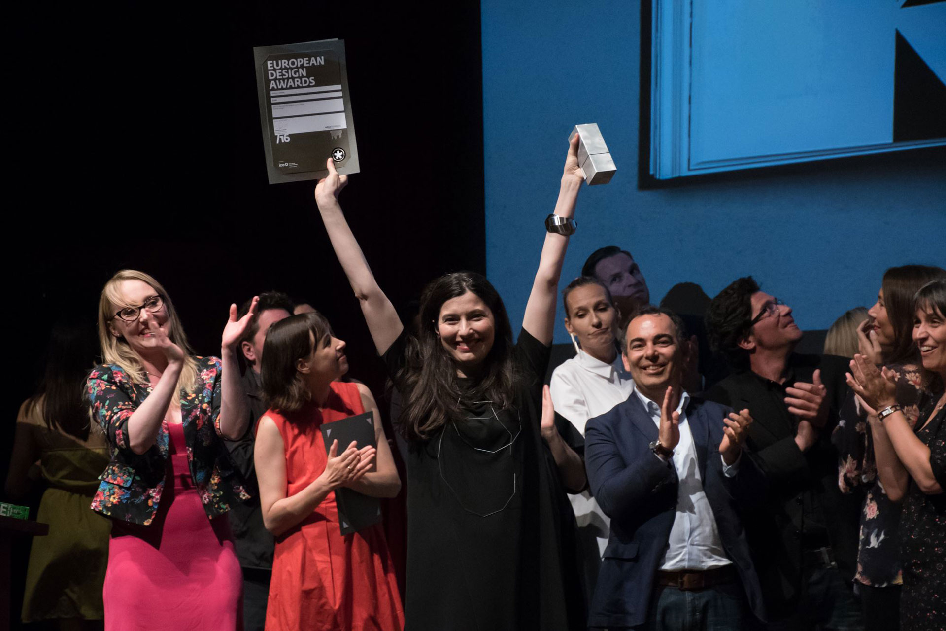
Other Awards and Nominations: The Most Beautiful Book of the Year 2015: The Prize of the Typodesign Club for Graphic Design, The Prize of the Union of Printing Houses, The Vojtěch Preissig Prize, Magnezia Litera Nomination, Czech Grand Design 2015 Nomination: Graphic Designer of the Year, German Design Award nominee 2017
© 2015, published by Akropolis and the Academy of Arts, Architecture and Design in Prague, with the generous support of the Capital City of Prague, Czech Ministry of Culture, Fedrigoni and Typodesign.
Are you interested in this project? Do you need help with design or brand direction? Would you like to create a beautiful book? We want to hear more.
Write to our studio and we’ll get back to you.