
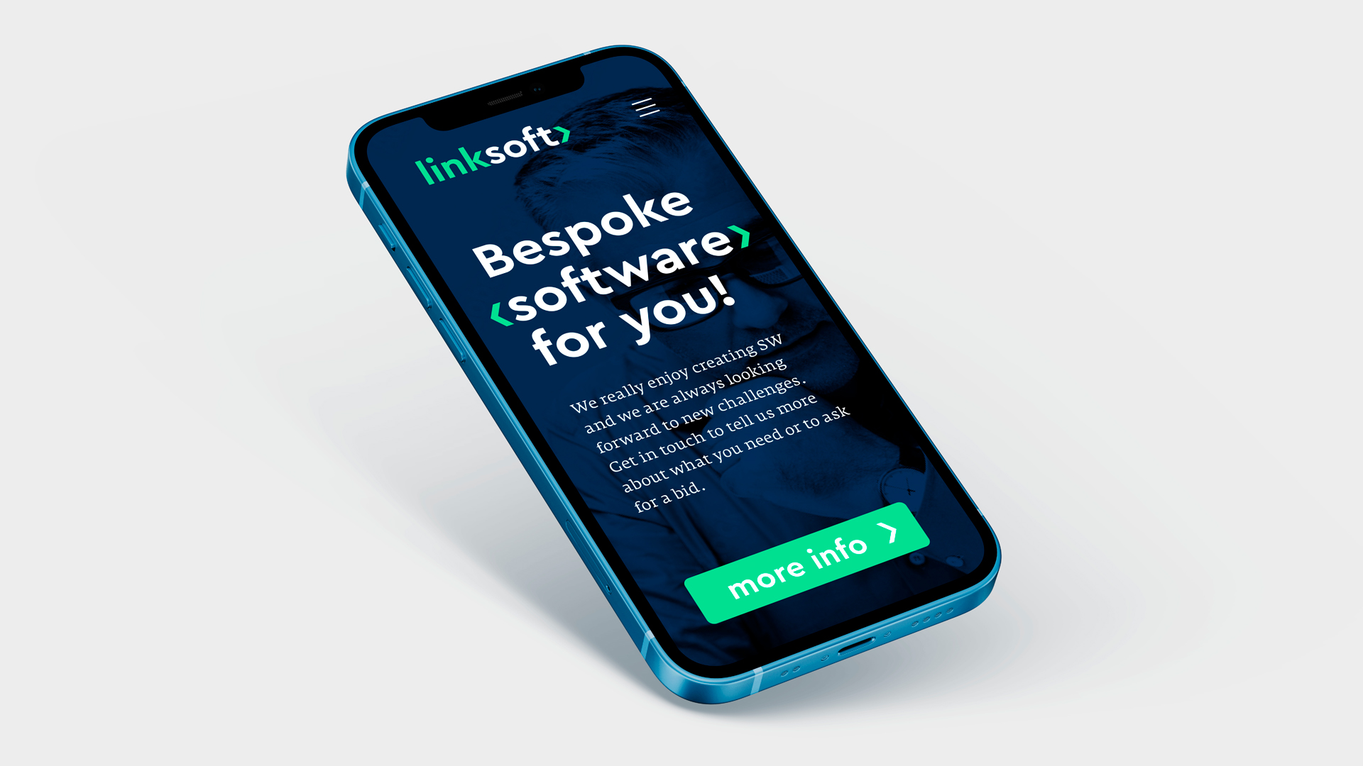

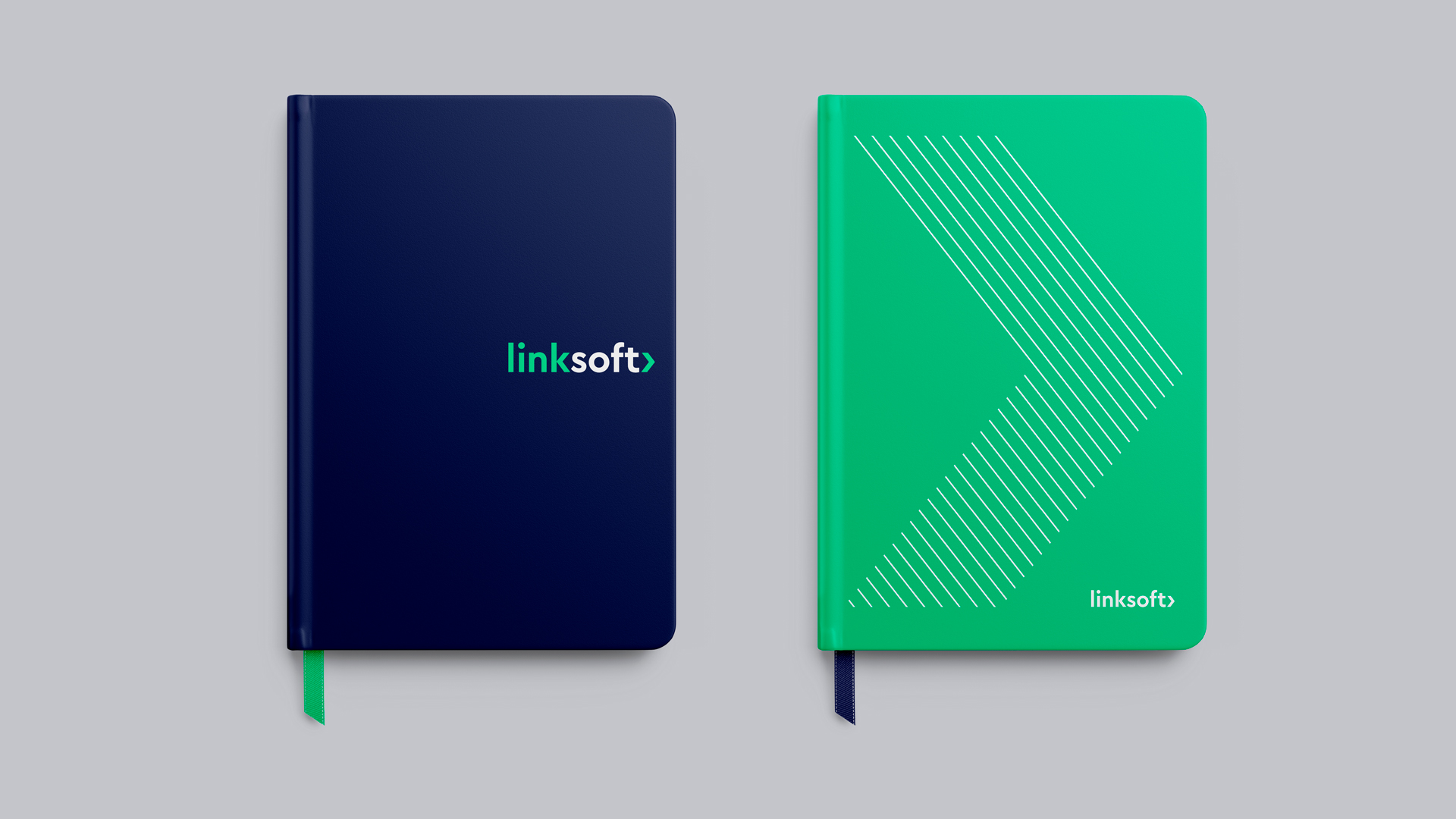
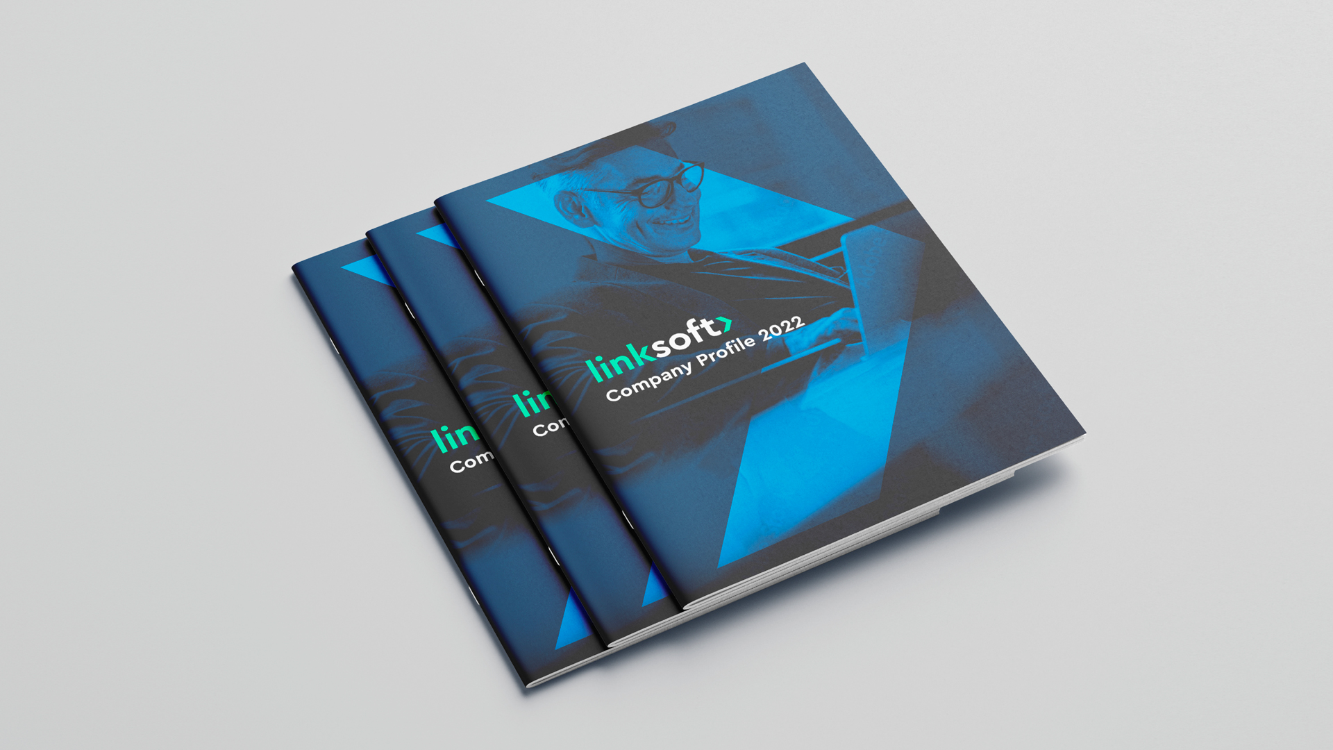
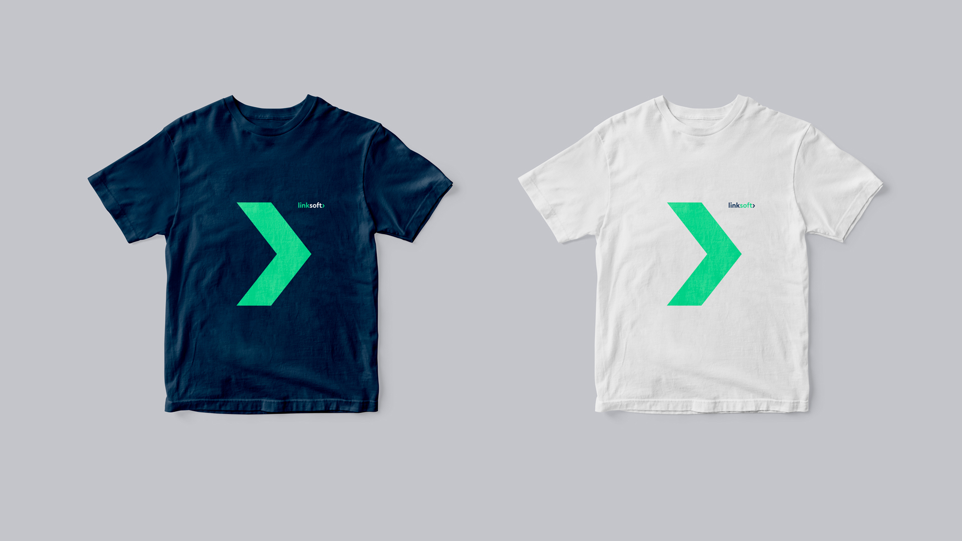
Linksoft is a great Czech company developing customized, complex and highly sophisticated business software. However, product focus has long sidelined branding. From the original form, we kept only the basics of color and moved it to more pleasant tones, we supplemented the serious, dark blue color with energetic green. The CeraPro font, on which the entire visual identity is built, is complemented in the logo by a simple ">" symbol, characteristic of the entire IT area, which at the same time derives its shape from the letter "k". Both < / > symbols are further used to accentuate part of text messages. In contrast to the technical grotesque, the Cera Pro font family is complemented by the antique Faustine.
© 2022, design Tibor Vizi

![linksoft_flash_1920[1].jpg](/upload/images/linksoft_flash_1920[1].jpg)
Are you interested in this project? Do you need help with design or brand direction? Would you like to create a beautiful book? We want to hear more.
Write to our studio and we’ll get back to you.
Related projects
