A strange house?
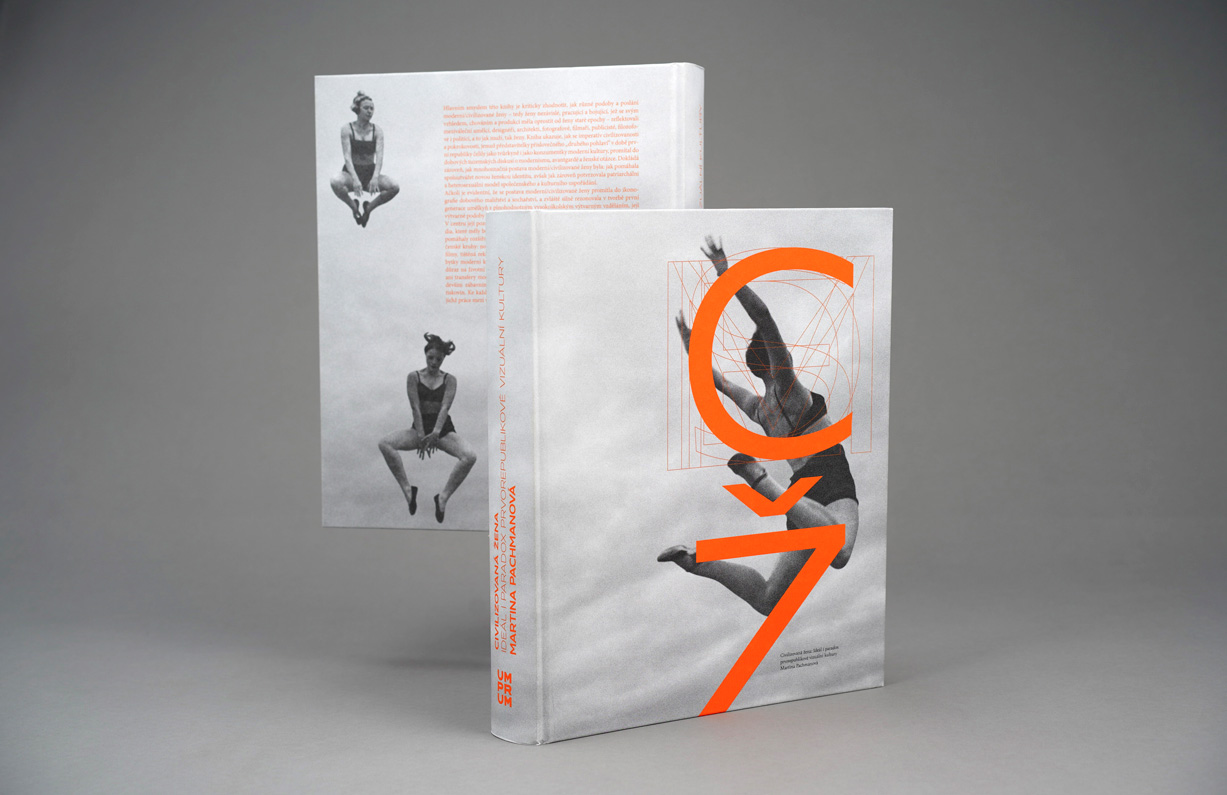
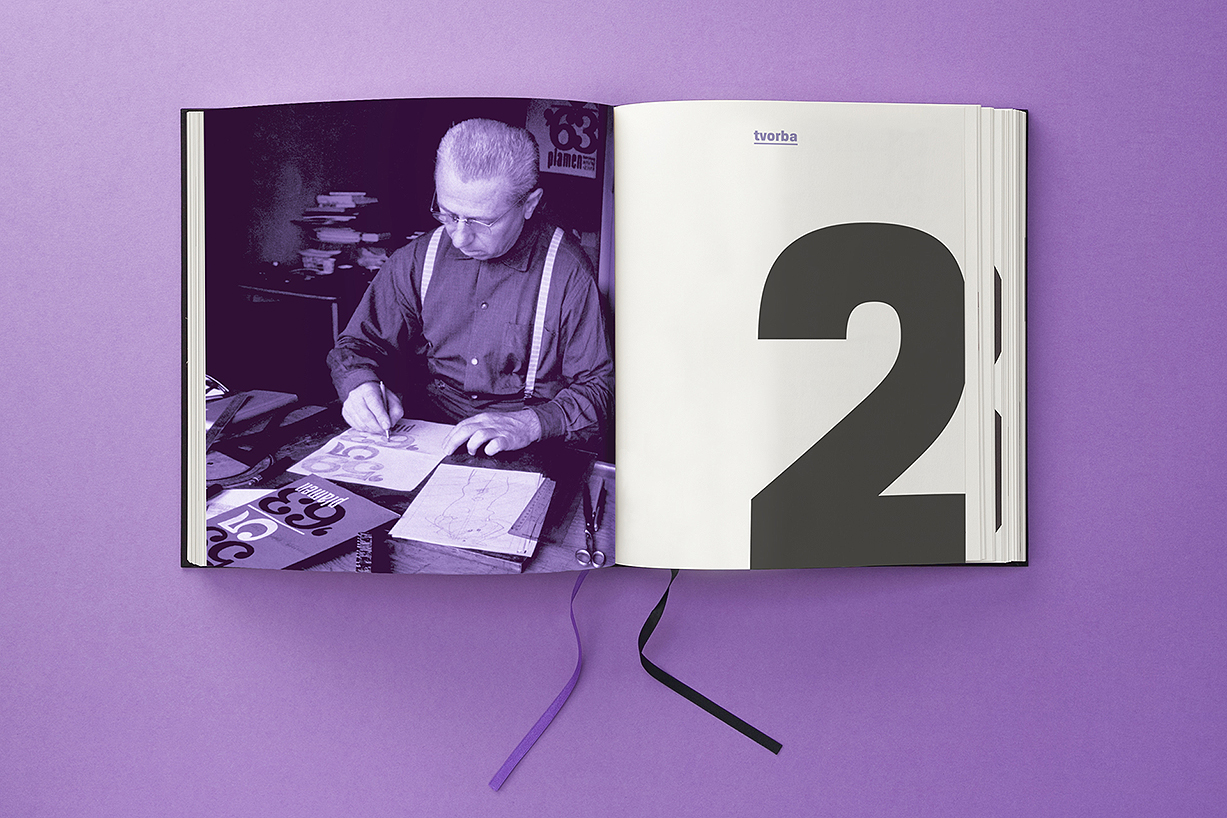
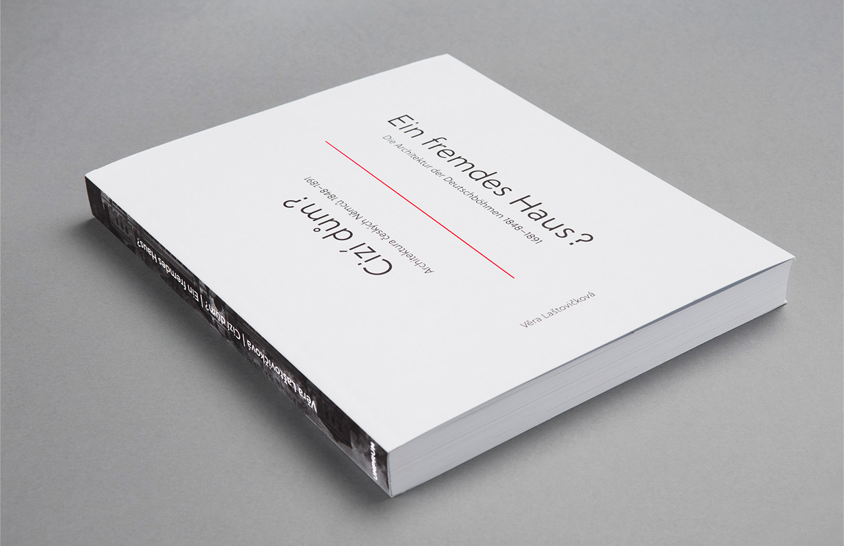
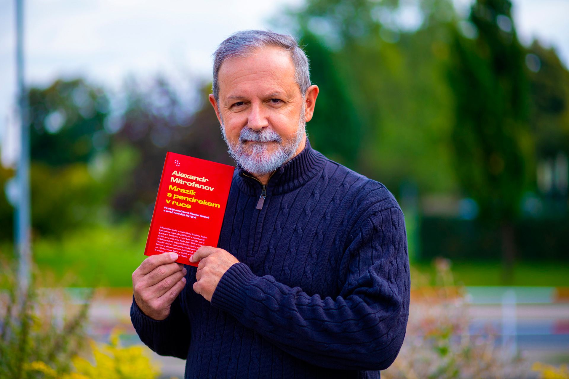
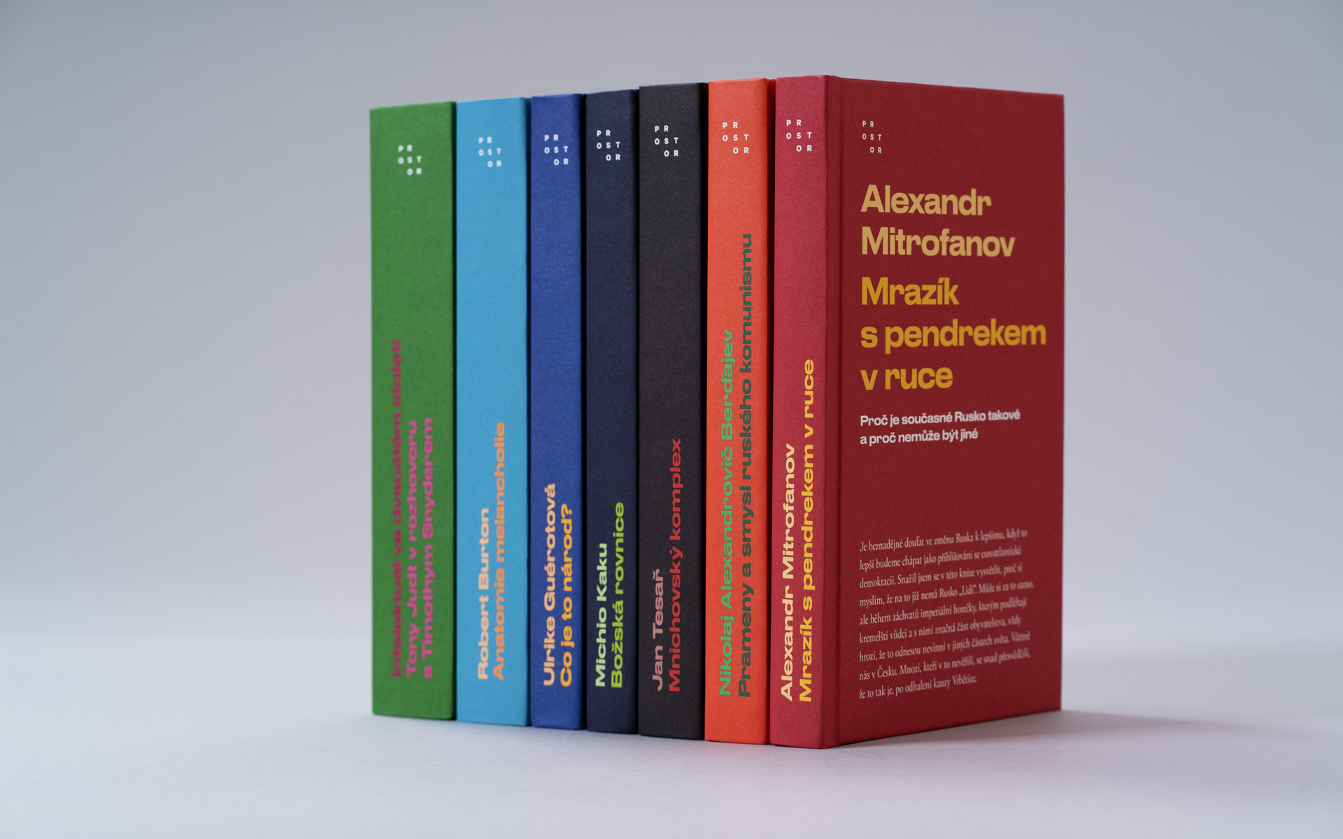
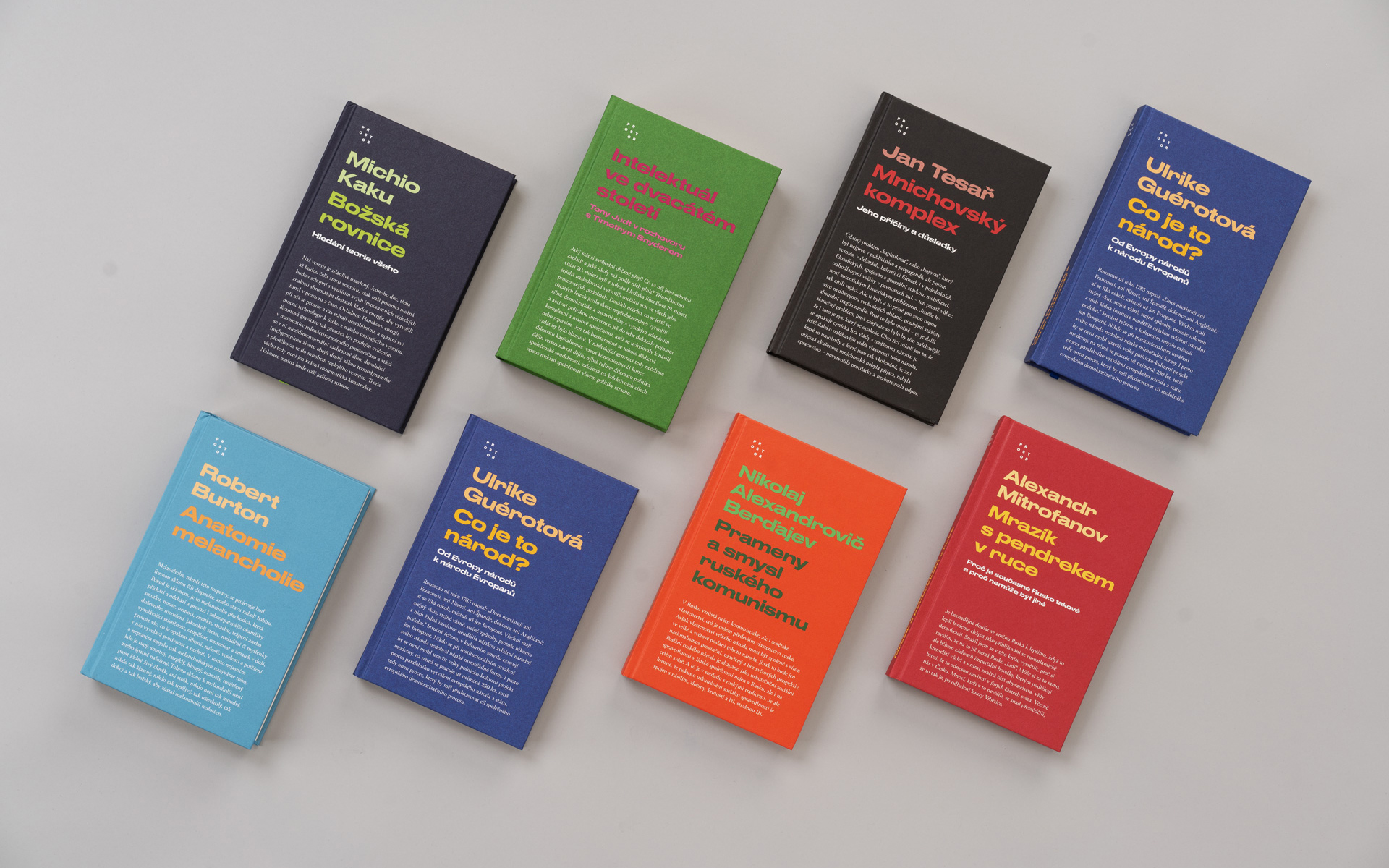
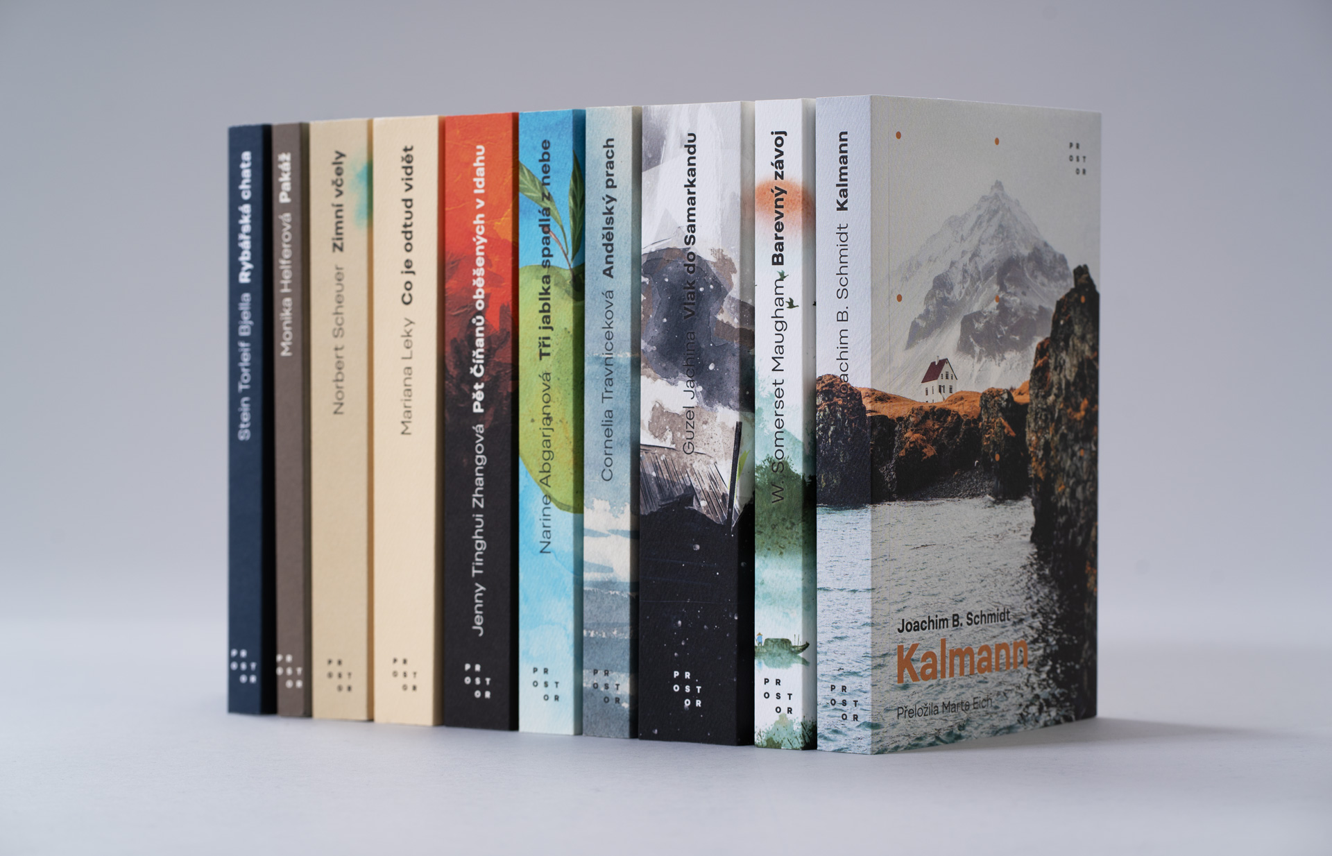
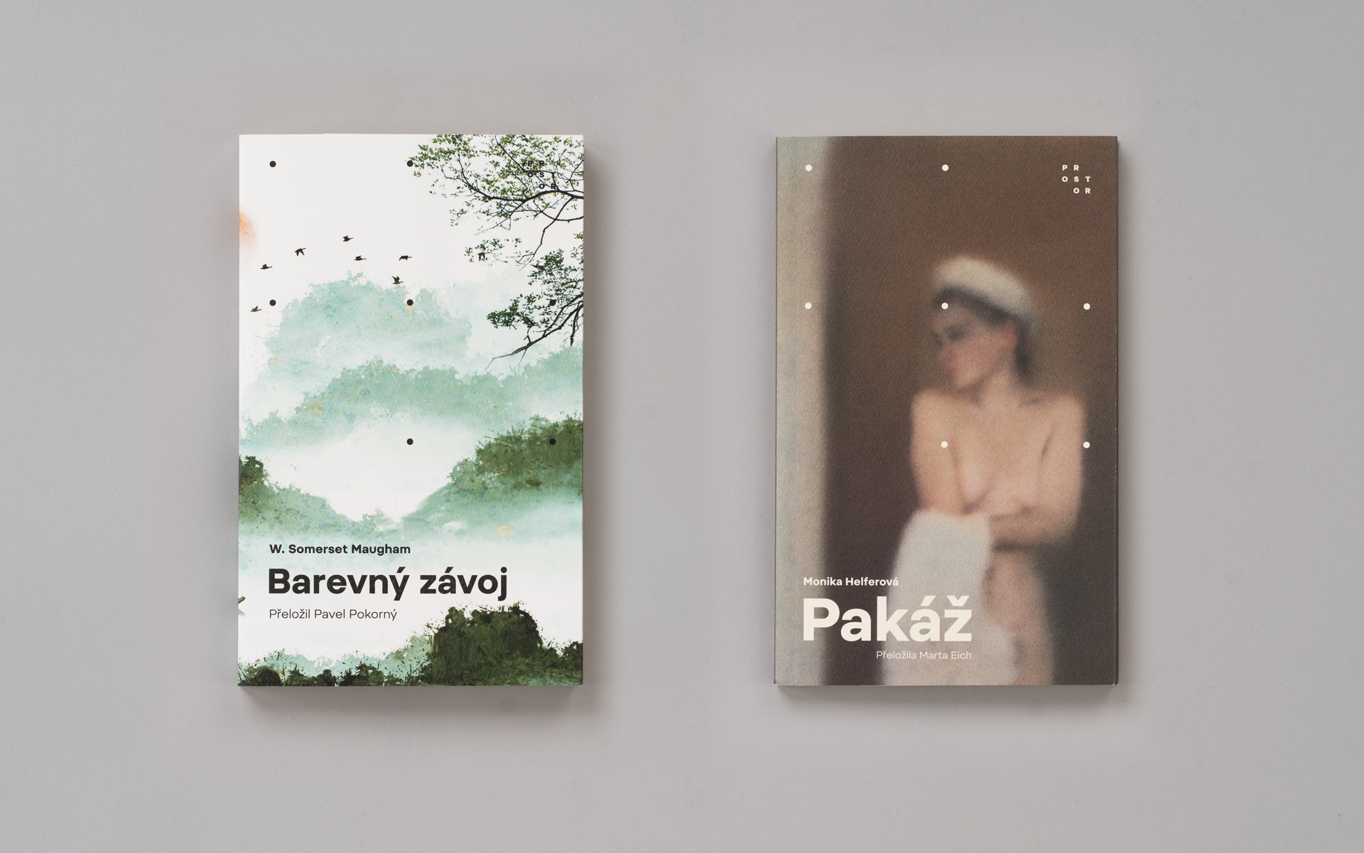
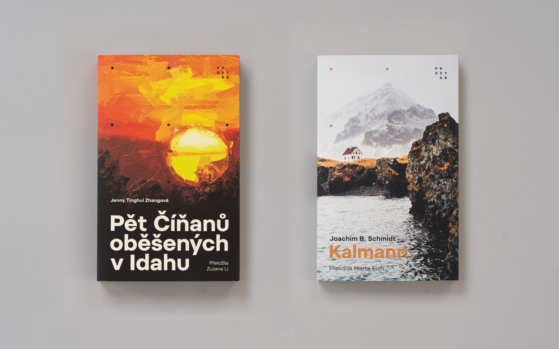
Without exaggeration, the first post-revolutionary publishing house Prostor publishes great books from fiction, through poetry to political science and historical literature for over thirty years. Since the early 1990s, they have lived with the original brand without any change. It was a great challenge for us to give the publishing house a new look. The solution is based on a modular logotype with ten logo variants. The position of individual letters of the Campton font in the matrix of 3x3 points is variable, with a fixed first and last character. In addition to the basic form of the logo, its variants can appear in the design of individual editions, for which we have also prepared a new graphic form. Edition "Střed" works exclusively with a typographically designed cover and two spot colors. Design of "Pozdní sběr" edition uses the variability of the logo, and in connection with its shape, the grid in which the pictorial motif of a specific book is displayed also changes.
© 2021, design and editions concept Tibor Vizi and Petr Bláha, animation Petr Milosh


![vizitky_mockup_1920x1440[1].jpg](/upload/images/vizitky_mockup_1920x1440[1].jpg)
![brozuranahled2_1920x1440[1].jpg](/upload/images/brozuranahled2_1920x1440[1].jpg)
![totebag2_1920x1440[1].jpg](/upload/images/totebag2_1920x1440[1].jpg)
![prostor_redtape_1920x1440[1].jpg](/upload/images/prostor_redtape_1920x1440[1].jpg)
Are you interested in this project? Do you need help with design or brand direction? Would you like to create a beautiful book? We want to hear more.
Write to our studio and we’ll get back to you.